Kahua Analytics Owner Package
Applicable Packages This article applies to the Kahua for Kahua for Owners package. If you are not sure if this is relevant to you, please contact your domain administrator.
The Kahua Analytics for Owner Package offers a suite of dashboards for keeping track of project costs, health, and timelines.
Detailed descriptions of each dashboard can be found below:
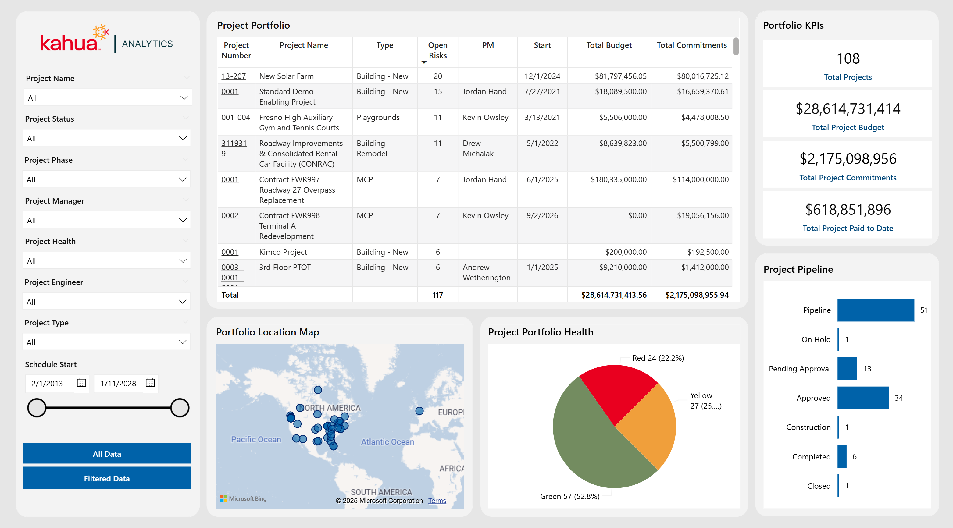
The Project General Portfolio Dashboard is a landing page that offers owners a broad overview of their entire project portfolio, focusing on key financial metrics, project status, and geographical spread. Filters allow for quick, targeted analysis by specific project attributes, such as Project Manager, Phase, Type, and Status. Visualizations, such as a funnel chart for status distribution, pie chart for health categorization, a map display of project locations, and a detailed project table, make it easy to assess both high-level trends and granular details.
Description
This dashboard aggregates core project information - budgets, commitments, payments, health, and location - into a single, interactive interface.
Problem
Owners managing large portfolios can struggle to quickly identify which projects are on track, over budget, or facing risks with fragmented data.
Benefit
By centralizing all essential data and enabling filtering by various project attributes, this dashboard streamlines project monitoring and highlights potential issues to ensure that all projects stay on track.
The following apps are necessary to utilize this dashboard:
-
Portfolio Manager
-
Addresses
-
Work Breakdown
-
Properties
-
Risk Register
-
Contacts
-
Companies
-
People
-
Out of the Box Dashboard Interface
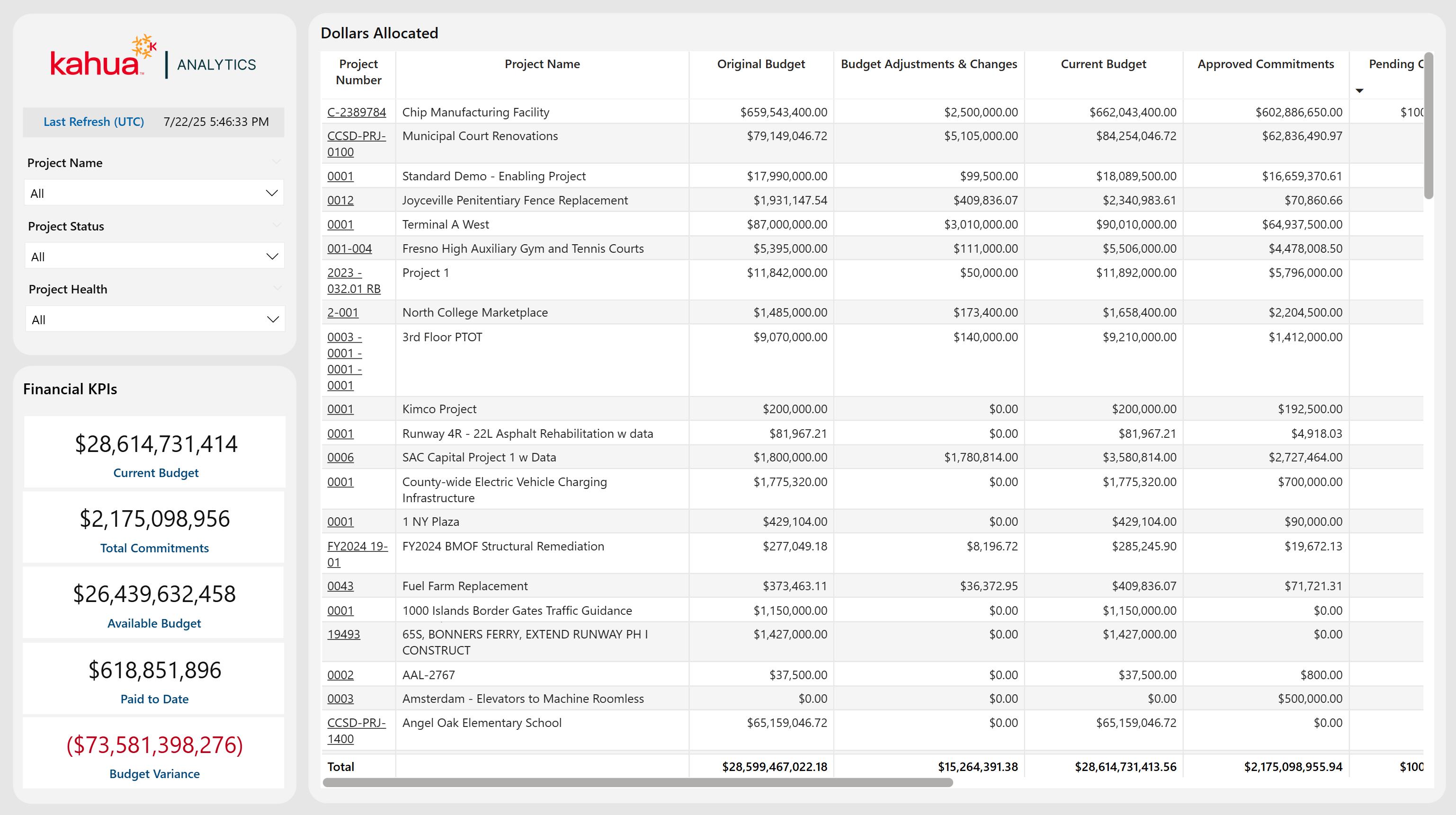
The Project Financial Portfolio Dashboard offers high-level insights into each project's financial health by leveraging the client's configuration in the Work Breakdown Structure (WBS) app. A detailed table lists each project's financial allocations and variances, making it straightforward to identify funding gaps, pending commitments, and potential cost overruns.
Description
This dashboard compiles all key financial data (budgets, commitments and payments) for each project into a single view, improving transparency and financial oversight.
Problem
Owners require a clear understanding of cost data to keep projects on schedule and within budget; without consolidated insights, funding deficits or overages can go unnoticed.
Benefit
By totaling all financial details in a single dashboard, teams can quickly spot funding issues and track payment progress at a high-level by project.
The following apps are necessary to utilize this dashboard:
-
Portfolio Manager
-
Work Breakdown
Out of the Box Dashboard Interface
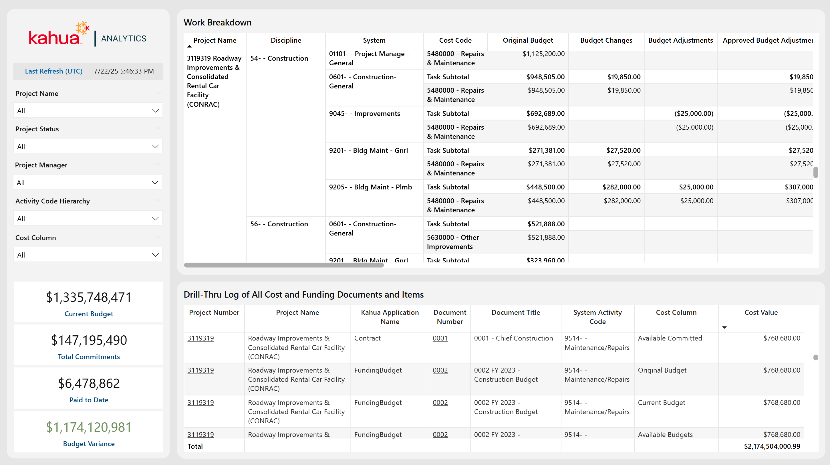
The Financial Portfolio Drill Thru Dashboard features a dynamic matrix visualization that displays Financial WBS data organized by Project Name and Hierarchical WBS Subtasks, providing a clear overview of cost allocations. Selecting a specific cost cell filters a detailed table to show all associated Funding and Expense Documents at an itemized level, with integrated hyperlinks for quick access.
Description
This dashboard combines a summary matrix of cost allocations with a detailed table of individual Funding and Expense Documents.
Problem
Owners need to be able to quickly trace specific summary cost components to their corresponding Financial Documentation.
Benefit
This page allows users to enjoy streamlined navigation and enhanced data visibility into their costs, which improves efficiency and confidence in Financial Analysis and Decision-Making.
The following apps are necessary to utilize this dashboard:
-
Portfolio Manager
-
Work Breakdown
-
Funding Suite
-
Expenses Suite
-
Addresses
Out of the Box Dashboard Interface
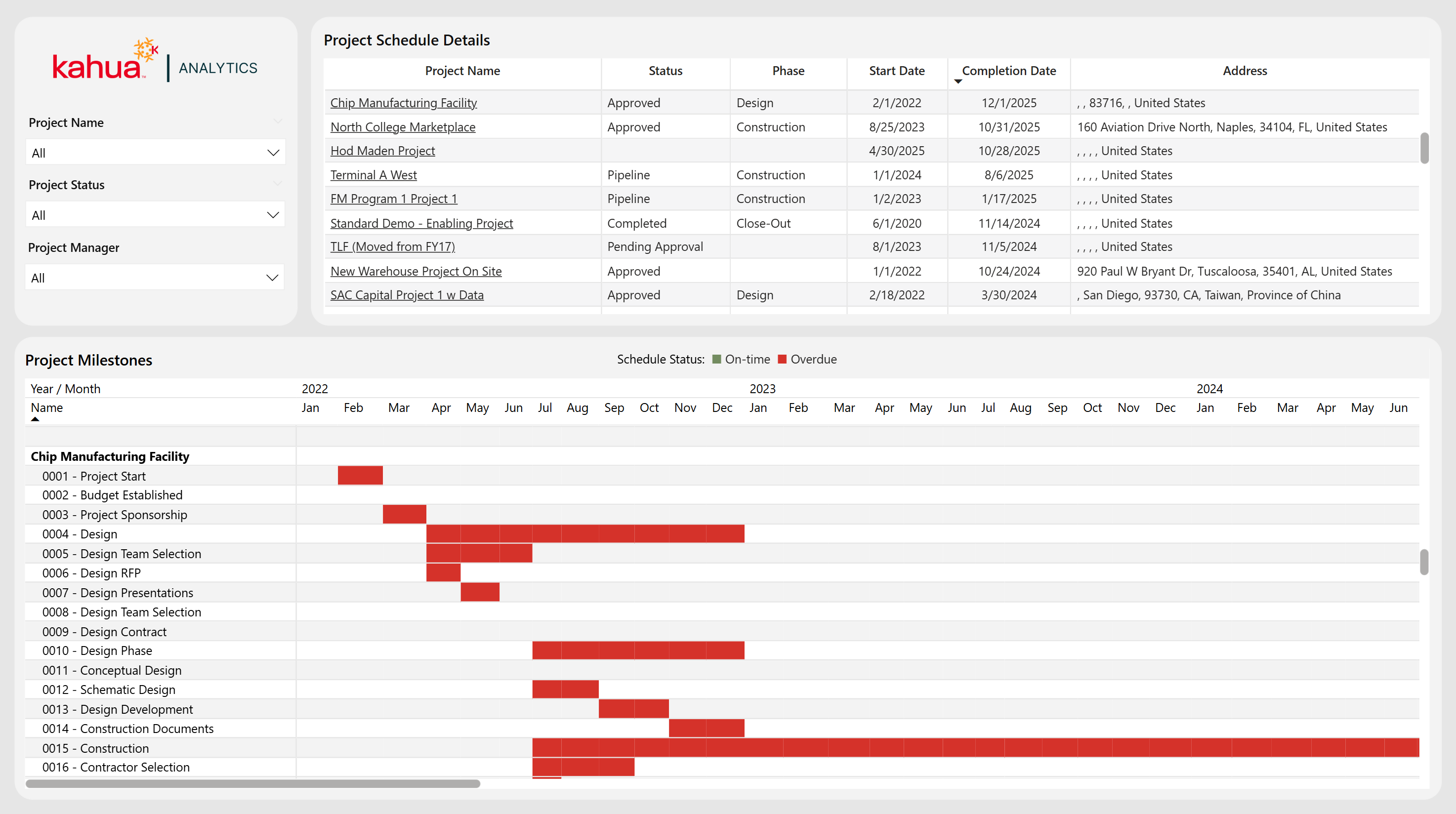
The Project Schedule Portfolio provides an integrated view of project scheduling across an owner's entire portfolio. It features a Gantt Chart that breaks down the project timeline into individual milestones . A table above the Gantt Chart provides visibility into the Phase, Status, Key Dates, and Location of each project, while filters allow for tailored views based on specific Locations, Phases, or Projects.
Description
This dashboard combines a Gantt Chart with a detailed project table for a comprehensive overview of overall timeline management.
Problem
Owners often face the challenge of managing and monitoring the timelines of many projects at once.
Benefit
This dashboard provides a consolidated, high-level overview, allowing users to quickly identify overdue projects and streamline portfolio management.
The following apps are necessary to utilize this dashboard:
-
Portfolio Manager
-
Milestones
-
Addresses
Out of the Box Dashboard Interface
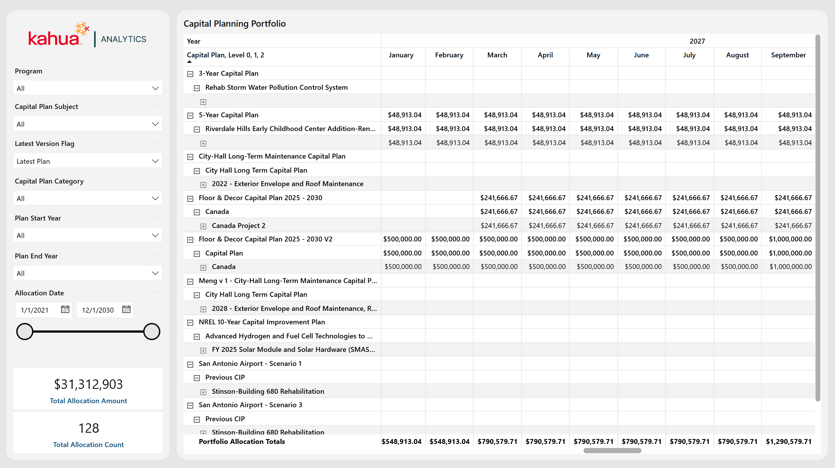
The Capital Planning Dashboard delivers a comprehensive view of capital planning data across the entire portfolio. It mirrors the Project Hierarchy structure for the Capital Planning app's "Manage" view, displaying every capital plan with detailed financial allocation amounts for each parent and child partition. Users can filter to view Capital Plans with specific statuses, categories, start / end years, or specific allocation date ranges. If they have multiple versions of the capital plan, users can also filter by the latest version. This allows them to tailor insights into Financial Planning into one unified view.
Description
This dashboard integrates all Capital Planning data and associated Project Hierarchies into one consolidated dashboard.
Problem
Owners often struggle with fragmented Capital Planning data, which can lead to misaligned investments and increased risk of budget overruns.
Benefit
By centralizing Capital Planning information, this dashboard allows users visibility into all their Capital Plans, ensuring better alignment between capital investments and future project execution.
The following apps are necessary to utilize this dashboard:
-
Portfolio Manager
-
Capital Planning
Out of the Box Dashboard Interface
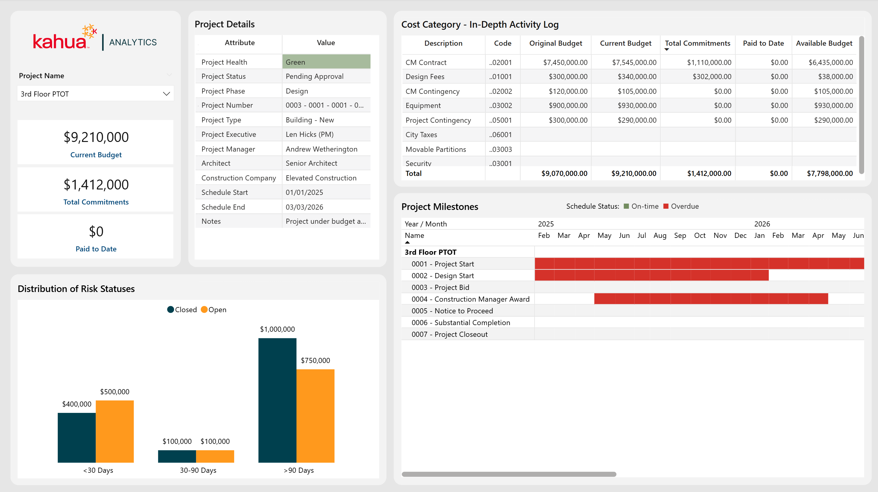
The Project Dashboard provides a comprehensive view into each project’s schedule / milestones, risk timeline / exposure, high level details, and financial metrics. Key metric cards call out the current budget, commitments, and payments to date. More insights come from an itemized cost log, a chart displaying the cost of risks by time category, and a Gantt chart for timelines and statuses.
Description
This dashboard aggregates budget, scheduling, and risk data for a selected project, enabling visibility into a project's progress and potential roadblocks.
Problem
Stitching together scattered information - financials, tasks, risks, and more - from multiple sources can be difficult. This increases the risk of cost or schedule issues.
Benefits
With every key project detail in a single dashboard, project managers can better keep their project(s) on course by quickly identifying emerging concerns and tracking key financials and milestones.
The following apps are necessary to utilize this dashboard:
-
Portfolio Manager
-
Work Breakdown
-
Risk Register
-
Addresses
-
Milestones
-
Contacts
-
Companies
-
People
-
Out of the Box Dashboard Interface
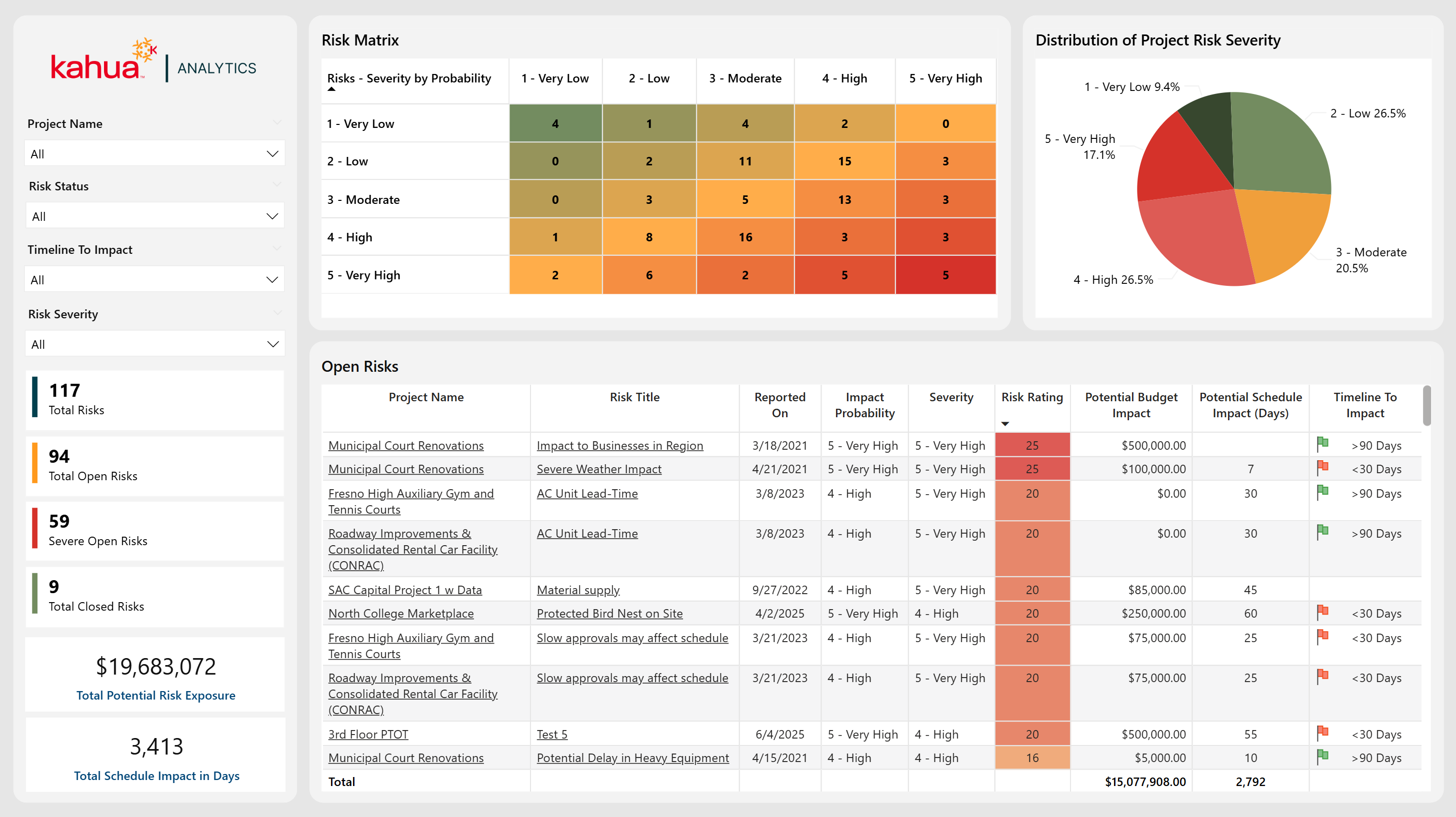
The Risks Dashboard highlights critical risk factors for each project, enabling proactive identification and mitigation of potential project threats. It provides an overview of each project's risk landscape, including how likely risks are to occur, their potential budget and schedule impacts, and overall severity. By tracking open, closed, and critical risks in real-time, teams can anticipate roadblocks and troubleshoot more effectively.
Description
This dashboard provides a focused view of both the volume and severity of project risks, along with their potential financial and schedule ramifications.
Problem
Teams often struggle to foresee and quantify project threats, causing delayed or reactive responses when risks escalate.
Benefit
By surfacing high-risk items and their likely impacts, this dashboard allows for more informed decision-making around risks and allows for timely preventative measures.
The following apps are necessary to utilize this dashboard:
-
Portfolio Manager
-
Risk Register
-
Contacts
-
People
-
Out of the Box Dashboard Interface
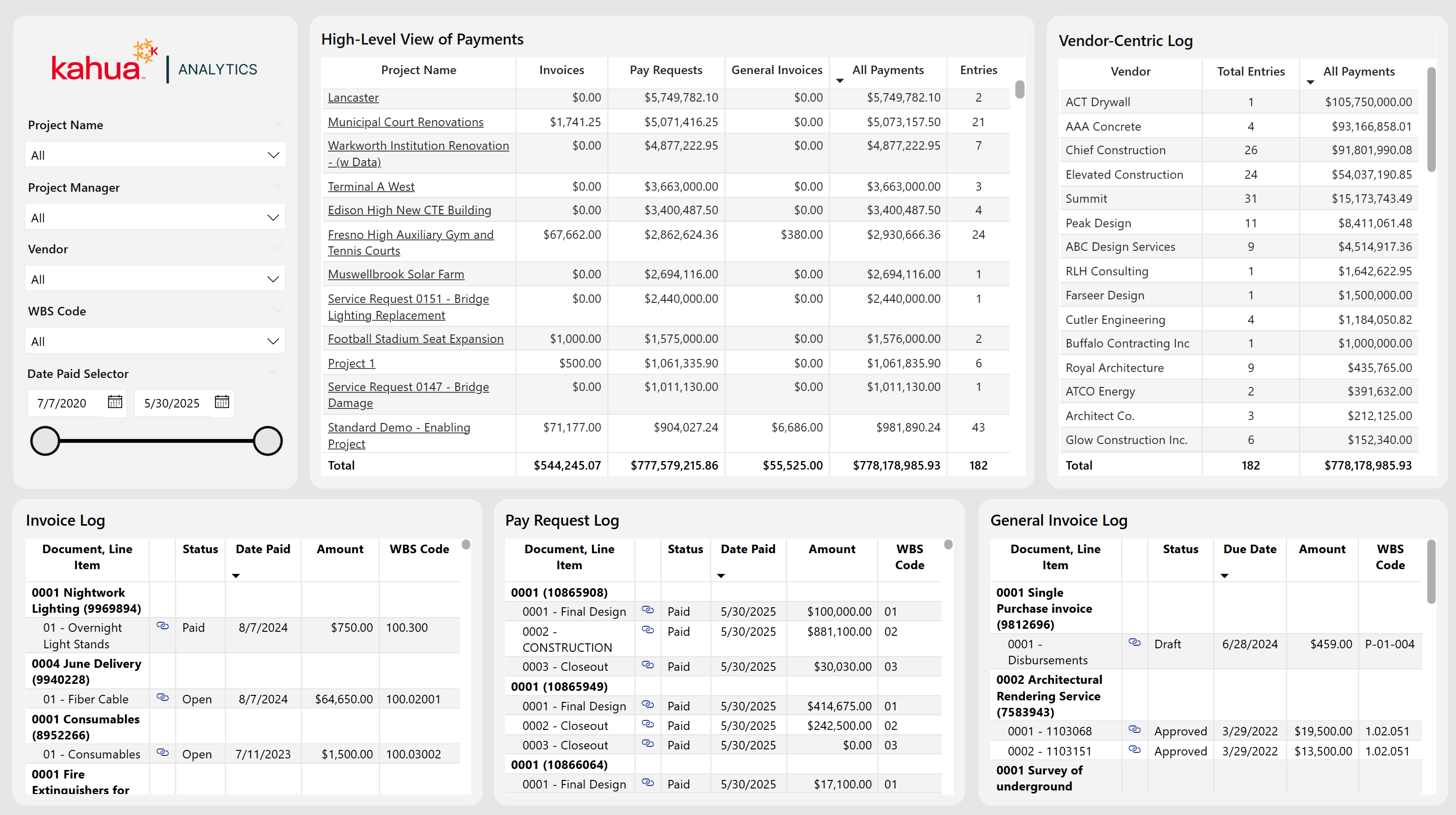
The Payments Dashboard provides a comprehensive overview of all payment activity across multiple projects, vendors, and transaction types. Built to unify Pay Requests, Invoices, and General Invoices, it offers both high-level details on payments and granular insights to help maintain transparency over financial operations.
Description
This dashboard features a project-level summary table highlighting payment activity across three different payment apps, plus a vendor-centric log for analyzing payment totals and entries per vendor. Three additional tables display line-item detail for each Payment App, complete with direct links to each record, to allow users to verify the status of their payments and easily locate them within Kahua.
Problem
Without a clear, centralized view to monitor payments, owners can risk delays, duplicates, or overlooked transactions that can jeopardize budget accuracy and cash flow.
Benefit
By offering clear visuals on the status of invoices, pay requests, and general invoices, teams can maintain healthier financial control over their projects, by tracking incoming and outgoing payments and verifying the accuracy of data input within Kahua. Streamlined drill-down capabilities further support timely decision making and minimize administrative effort.
The following apps are necessary to utilize this dashboard:
-
Portfolio Manager
-
Invoices
-
Pay Requests
-
General Invoices
-
Work Breakdown Structure (WBS)
-
Kahua AEC Cost
-
Contacts
-
Companies
-
Out of the Box Dashboard Interface
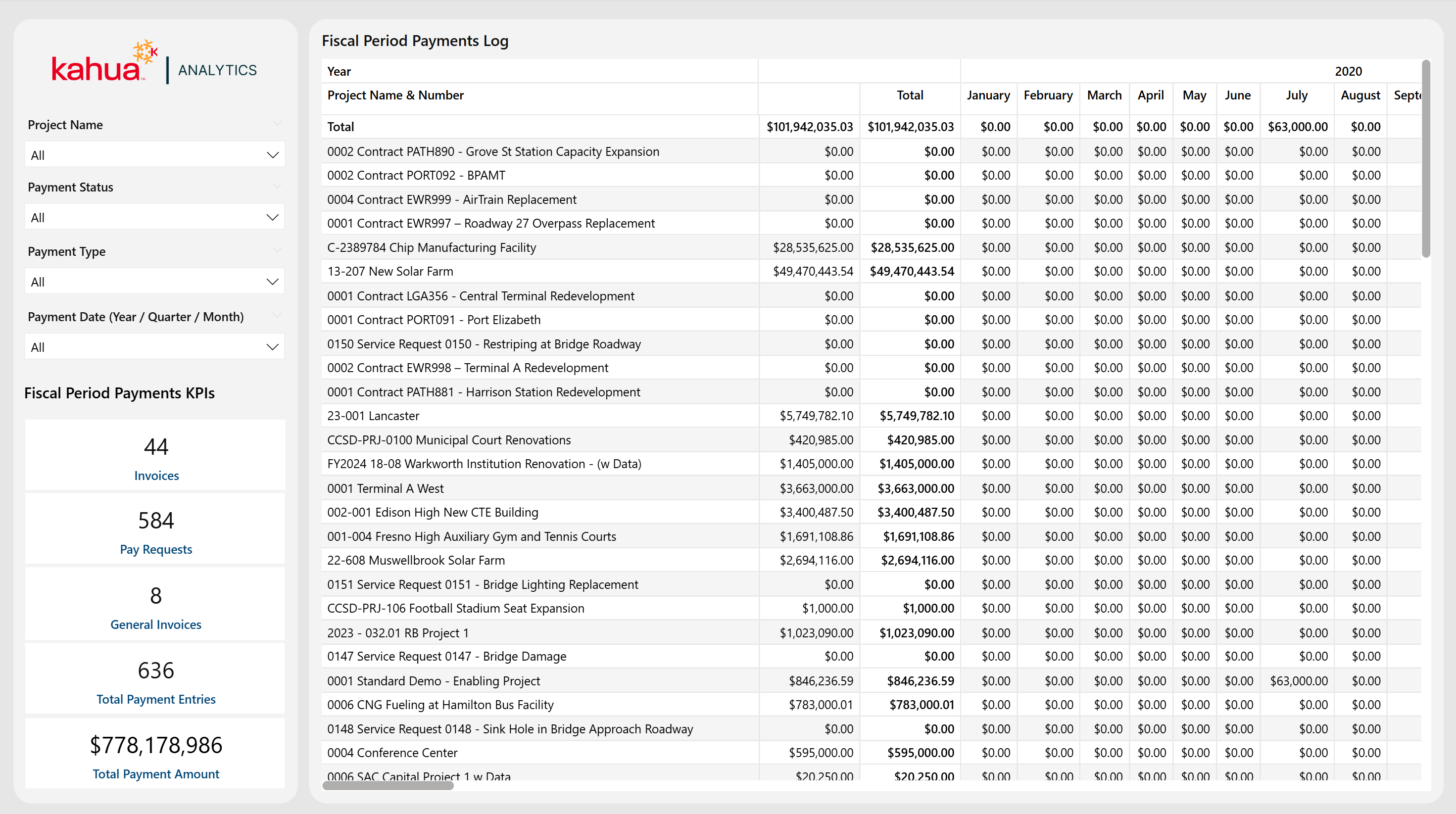
The Fiscal Period Payments Dashboard provides a year-by-year breakdown of invoices, pay requests, and general invoices, giving a clear picture on how project payments align with budget cycles. With powerful filters and prominently displayed KPIs, this dashboard helps teams monitor long-term financial payments and confirm timely disbursements.
Description
This dashboard displays total payments over specified fiscal periods, highlighting annual totals of all payments. It also displays the designated KPIs across all projects. These KPIs include the number of invoices, pay requests, general invoices, total payment entries, and overall total payment amount.
Problem
Tracking financial transactions across multiple projects and fiscal years can be cumbersome, risking misalignment with corporate budget cycles.
Benefit
By organizing payments by year, owners and financial teams can efficiently verify spending patterns, anticipate cashflow needs, and maintain better financial oversight.
The following apps are necessary to utilize this dashboard:
-
Portfolio Manager
-
Invoices
-
Pay Requests
-
General Invoices
-
Work Breakdown Structure (WBS)
-
Kahua AEC Cost
-
Contacts
-
Companies
-
Out of the Box Dashboard Interface
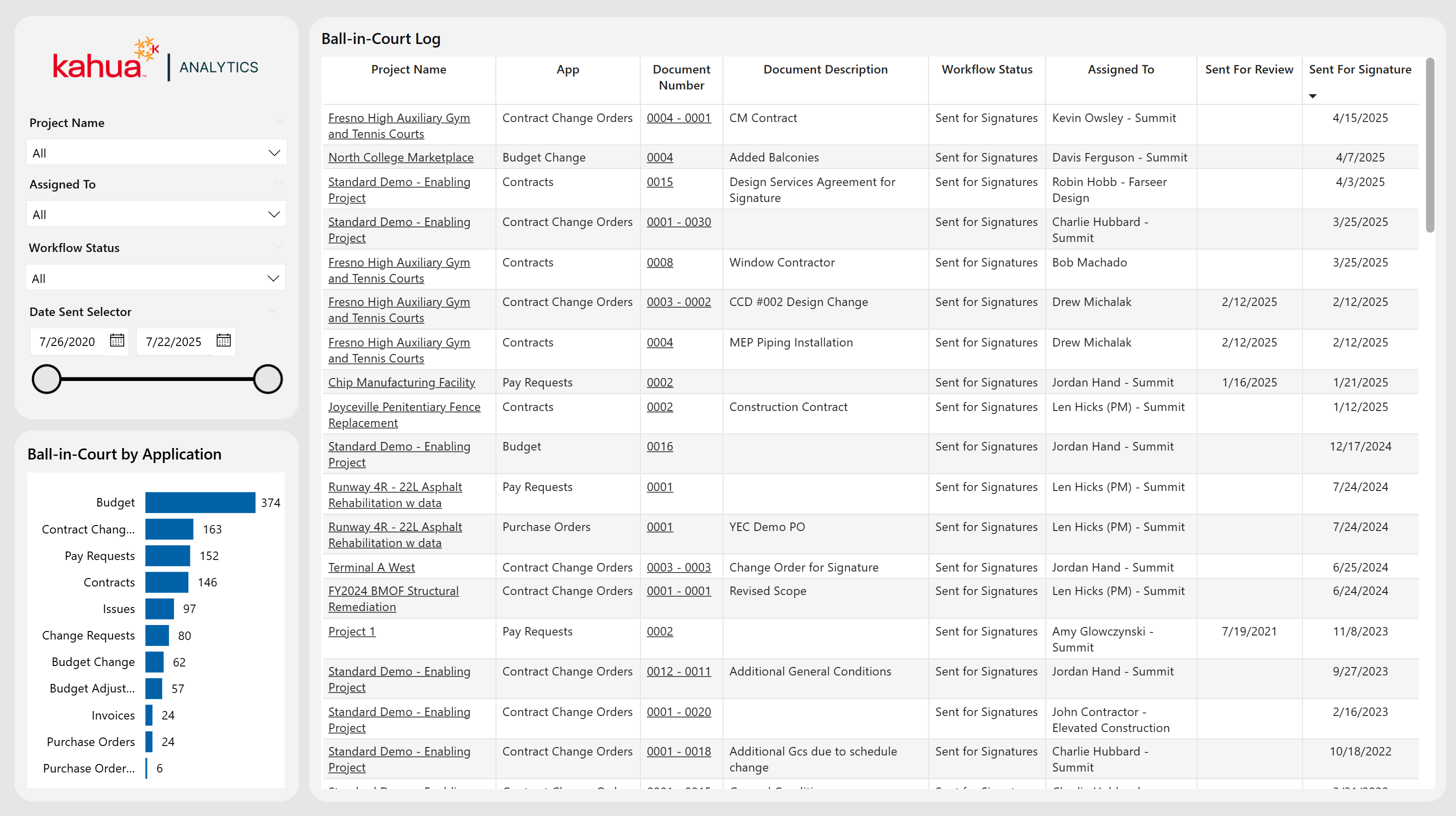
The Workflow Status Log Dashboard captures all items across a variety of Kahua Cost and Funding apps that go through an approval process. It also shows who currently owns each task as their ball-in-court item. Furthermore, it displays the high-level count of work flow items for users per app. Through filtering by status, project name, date sent, and the team or individual the item is assigned to, project managers and team members can quickly pinpoint stalled items and track accountability for reviews. This way, they can maintain a timely approval pipeline.
Description
This dashboard tracks in-progress approvals across projects, displaying key details like application, status, assigned person, and time stamps for review and signature. Additionally, users can view a high-level count of work flow items per app, and using hyperlinks, users can quickly pull up the app records of their assigned items.
Problem
Amid busy projects, approvals can fall behind schedule when stakeholders are not sure who is responsible for the next steps. This is especially true when many different documents and people are involved.
Benefit
By highlighting each item’s owner and status in real time, the dashboard helps teams prioritize pending tasks, resolve any bottlenecks, and keep project workflows moving.
The following apps are necessary to utilize this dashboard:
-
Portfolio Manager
-
Expenses Suite
-
Funding Suite
-
Contacts
-
Companies
-
Out of the Box Dashboard Interface
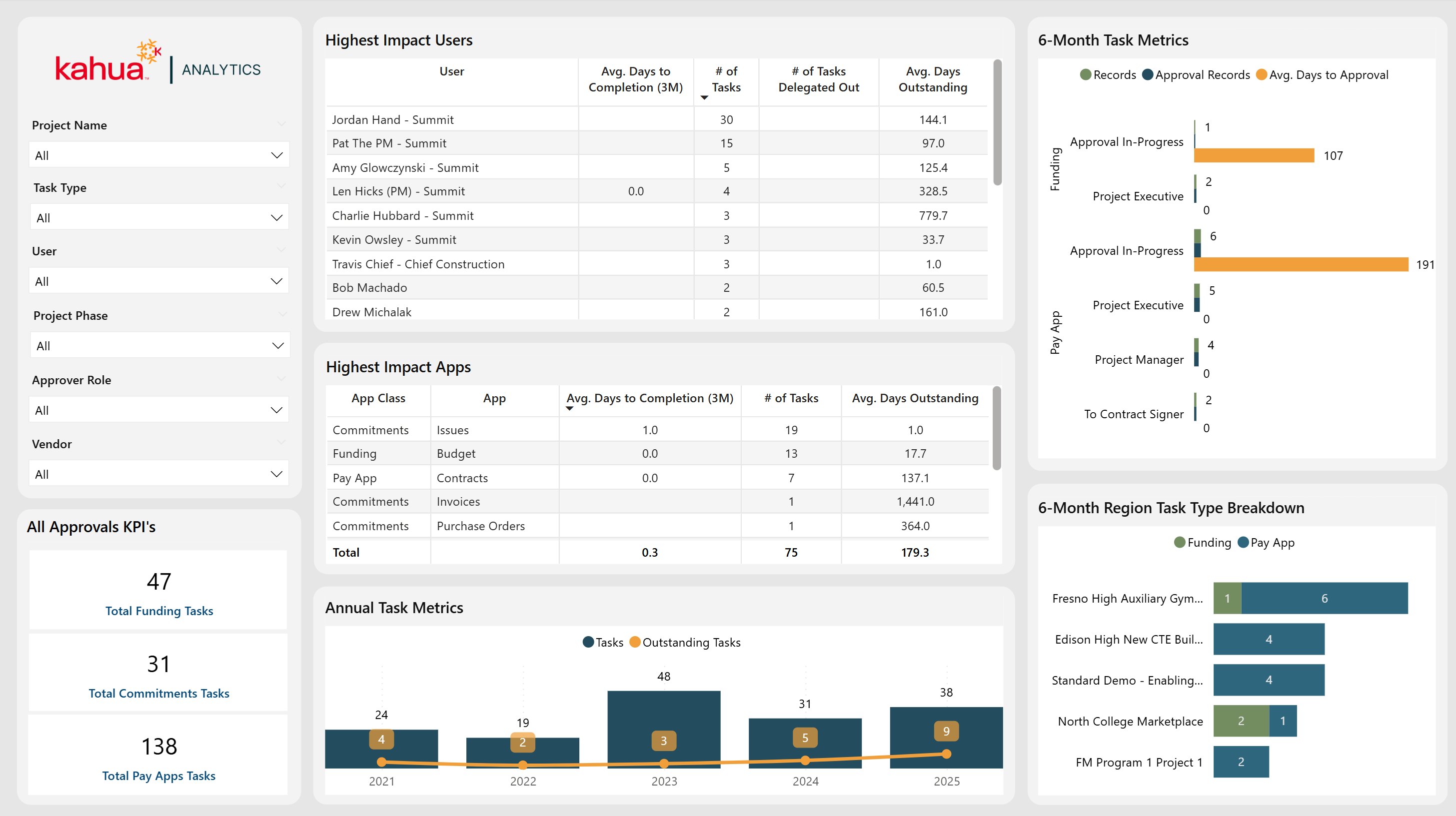
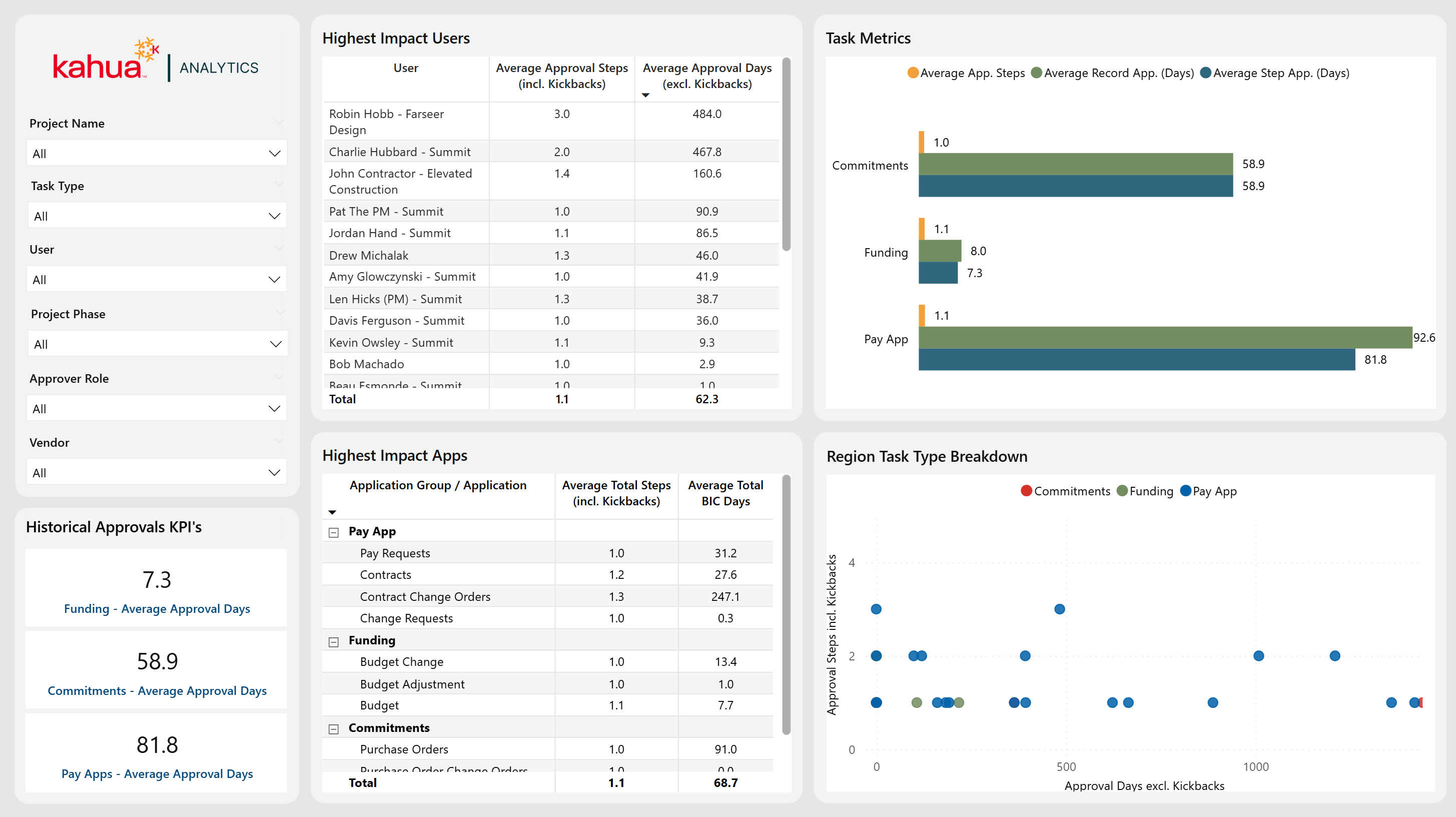
The All Approvals Dashboard spotlights user and application performance in task approvals and approvals-in-progress, providing both high-level metrics and in-depth breakdowns on where and how delays might occur. Filters allow the user to focus on specific projects, roles, applications, or vendors, allowing for more targeted analysis of approval timelines and outstanding tasks. A graph displaying the number of approval tasks and current outstanding tasks by year further showcases this data.
Description
This dashboard offers a comprehensive view of which users and apps have the biggest impact on approval cycle times, supported by charts displaying yearly and monthly task types and roles, as well as average days to approval.
Problem
In approval processes that have multiple steps, it's challenging to pinpoint who or what is causing delays. This undermines accountability and has the potential to stall project progress.
Benefit
By isolating high-impact users, applications, and roles - along with their task volumes and time-to-completion - teams can streamline approvals and delegate tasks efficiently.
The following apps are necessary to utilize this dashboard:
-
Portfolio Manager
-
Expenses Suite
-
Funding Suite
-
Issues
-
Workflow Manager
-
Contacts
-
People
-
Companies
-
Out of the Box Dashboard Interface
The Historic Approvals Dashboard analyzes past approval processes to uncover patterns in both user and application performance. While the All Approvals dashboard shows data on both approved items and approvals-in-progress, this dashboard focuses solely on approved items. Filters allow users to look into specific projects, phases, roles, or vendors, while the visualizations depict average approval steps, durations, and task-type distributions.
Description
This dashboard highlights the average number of approval steps and kickbacks over time, as well as highest-impact users or applications. This shows where in the approval process delays may occur.
Problem
Teams can often lack clarity on why historic approval cycles can take so long, making it difficult to improve future workflows.
Benefit
By identifying trends in approver roles, applications, and step counts, stakeholders can shorten approval cycles by streamlining their review processes.
The following apps are necessary to utilize this dashboard:
-
Portfolio Manager
-
Expenses Suite
-
Funding Suite
-
Issues
-
Workflow Manager
-
Contacts
-
Companies
-
People
-
Out of the Box Dashboard Interface
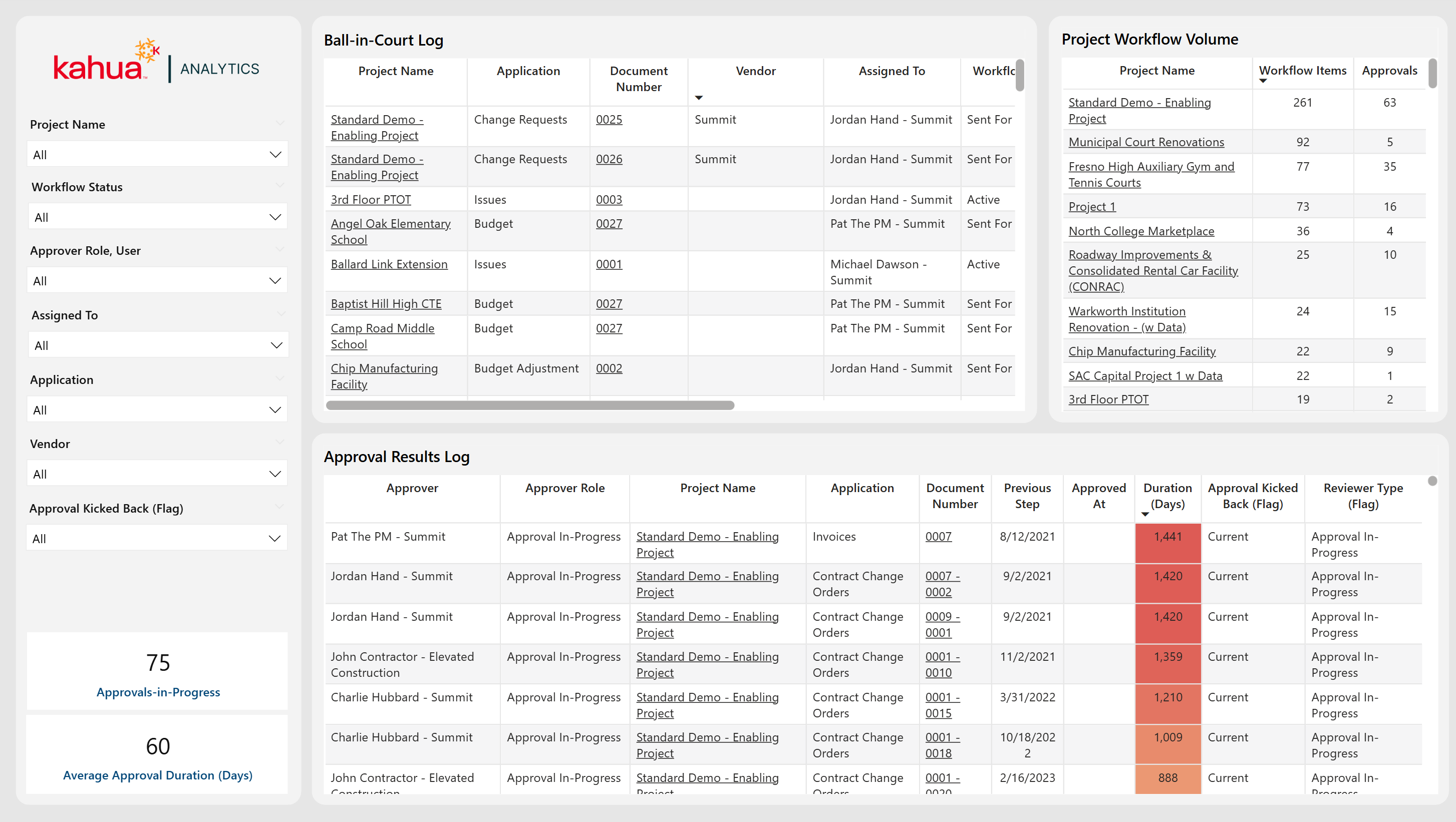
The All Approvals - Workflow Log Dashboard offers a dynamic view of every active approval, showing who currently has responsibility for the item, and the progress made so far on it. By selecting a specific workflow item from the Ball-In-Court Table, the dashboard filters to show the entire sequence of approval steps prior. This allows teams to pinpoint any potential bottlenecks or reassign tasks as needed.
Description
This dashboard tracks each stage of the approval process, from the assigned approver to total steps taken and outcome reached.
Problem
Without clear insight into who currently holds responsibility and how previous approvals transpired, important tasks could stall indefinitely. Also, there is limited visibility into how to improve workflows.
Benefit
By surfacing both current and historical approval data in a single workflow log, teams gain immediate visibility into pending actions, which can speed up approvals and improve accountability.
The following apps are necessary to utilize this dashboard:
-
Portfolio Manager
-
Expenses Suite
-
Funding Suite
-
Workflow Manager
-
Contacts
-
Companies
-
People
-
Out of the Box Dashboard Interface
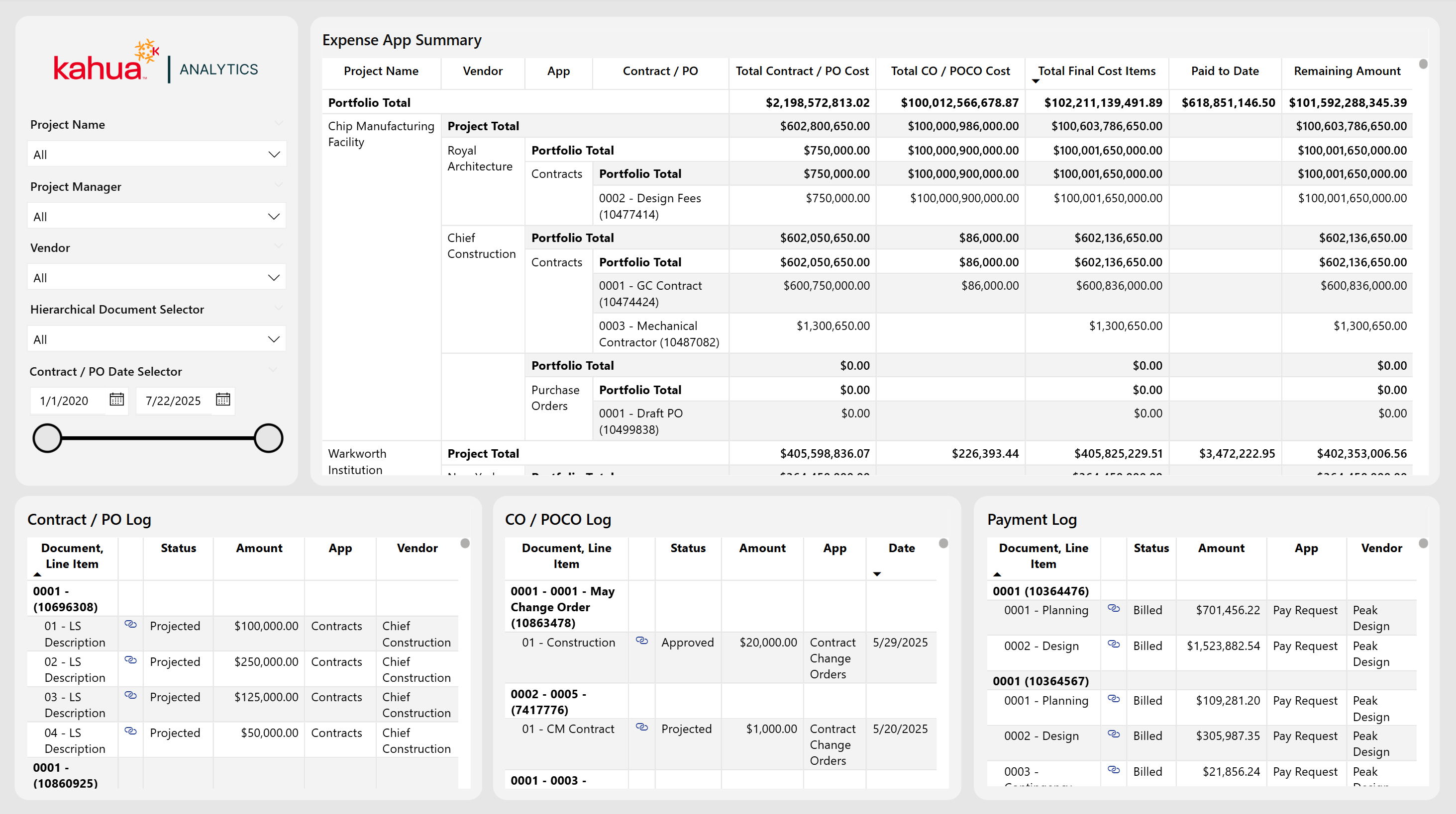
The Expense Activity and Vendor Hierarchy Dashboard combines vendor-centric data with a structured expense hierarchy, giving teams a centralized view of contractual commitments, change orders, and associated payments on all projects across a portfolio. It streamlines oversight by unifying vendor activity, change orders, and costs into a single interactive interface.
Description
This dashboard features a visualization organized by project, vendor, expense app, and the specific expense document's name. It displays total costs including change orders, amount paid to date, and amount remaining to pay. Three logs at the bottom break out Contracts / POs, Change Orders / POCOs, and Payment entries. From these logs, users can view details about their status and costs at an individual document level.
Problem
It can be challenging to keep tabs on total expenditures, change orders, and vendor responsibilities. Reconciling different expense items and tracking changes across multiple orders can be cumbersome. This increases the risk of inaccurate budget forecasts or overlooked cost updates.
Benefit
By exposing cost allocations and vendor participation in a single place, project managers can spot potential overspending, evaluate vendor performance, and effectively distribute work between contractors. Additionally, by hierarchically linking each cost item to its WBS code and vendor, teams can ensure more reliable expense management and maintain cleaner financial records.
The following apps are necessary to utilize this dashboard:
Contracts OR Purchase Orders
Change Orders OR Purchase Order Change Orders
Pay Requests OR Invoices
-
Portfolio Manager
-
Purchase Orders
-
Purchase Order Change Orders
-
Expense Contracts
-
Expense Change Orders
-
Invoices
-
Pay Requests
-
Work Breakdown Structure (WBS)
-
Contacts
-
Companies
-
Out of the Box Dashboard Interface
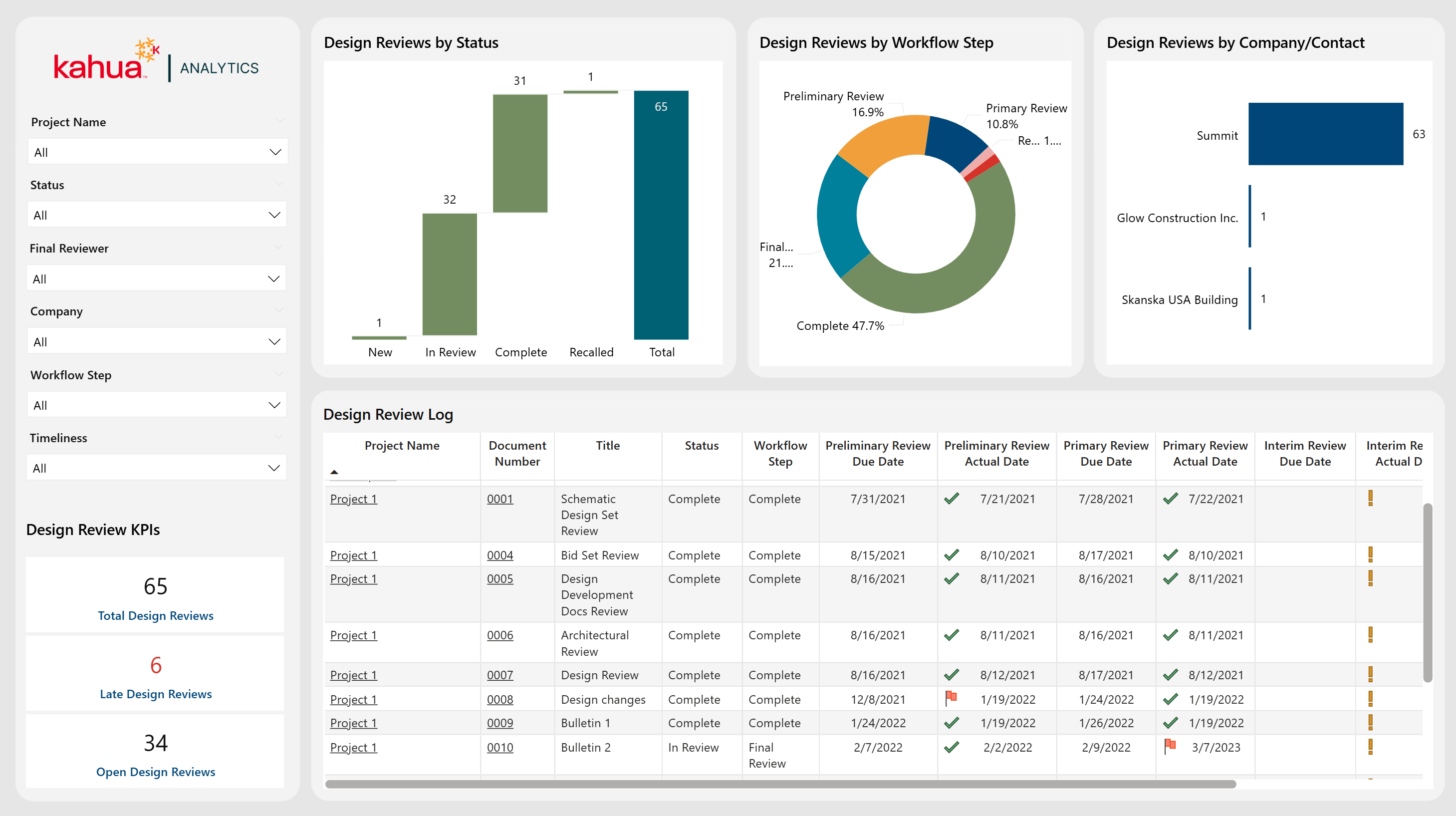
The Design Review Dashboard tracks each review's status, due dates, and completion timeline, flagging any late submissions so that teams can stay proactive. It includes multiple charts that display the design review by status, workflow step, and company / contact. Through filtering by project name, review status, final reviewer, or workflow step, users can quickly see where a design review stands. A timeliness filter allows users to filter by reviews that are complete, overdue, or missing data, giving them the ability to keep track of which reviews are completed on time.
Description
This dashboard centralizes all design reviews into one place. It lists key milestones (i.e. preliminary, primary, interim, and final) and displays which reviews have met their deadlines.
Problem
When review tasks and deadlines are not clearly tracked, design phases can be delayed. This can lead to cost overruns and deadline extensions.
Benefit
By clearly displaying overdue items and highlighting actual versus planned dates, the dashboard encourages timely reviews and helps to keep projects on schedule.
The following apps are necessary to utilize this dashboard:
-
Portfolio Manager
-
Design Review Sets
-
Contacts
-
People
-
Out of the Box Dashboard Interface
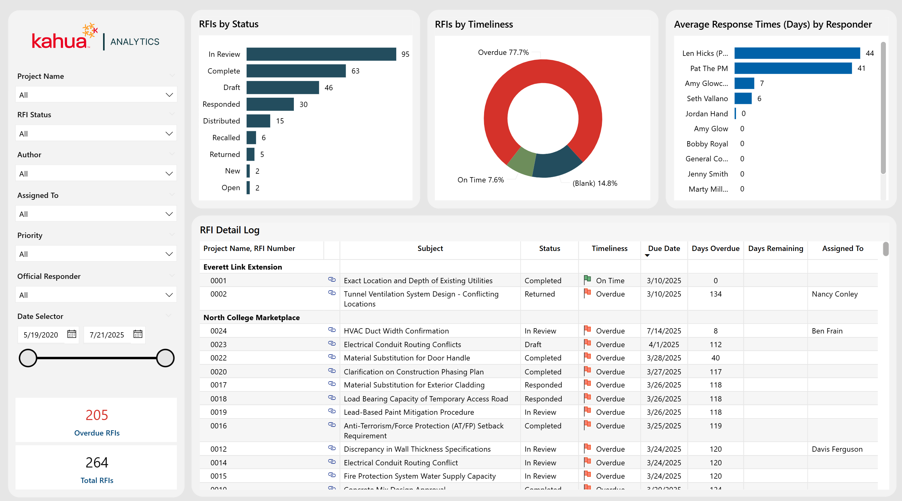
The RFIs Dashboard displays the details for RFIs associated with projects across the portfolio. Users can view open items, their due dates, and their responsible parties. Additionally, they can see associated upcoming and overdue deadlines, as well as their RFI distribution by timeliness. These features allow users to audit responders, their response times, and overall RFI volume.
Description
This dashboard serves as a single source of truth for RFI Management, including detailed logs, status charts, and average responder turnaround times.
Problem
With many incoming RFIs from many projects, it can be difficult to keep track of and answer all the requests in a timely matter. This can lead to communication gaps and missed deadlines.
Benefit
This dashboard helps to ensure timely responses by compiling all requests and their deadlines. It also improves responder accountability to reply to their assigned requests. This can help to reduce any project delays.
The following apps are necessary to utilize this dashboard:
-
Portfolio Manager
-
RFIs
Out of the Box Dashboard Interface
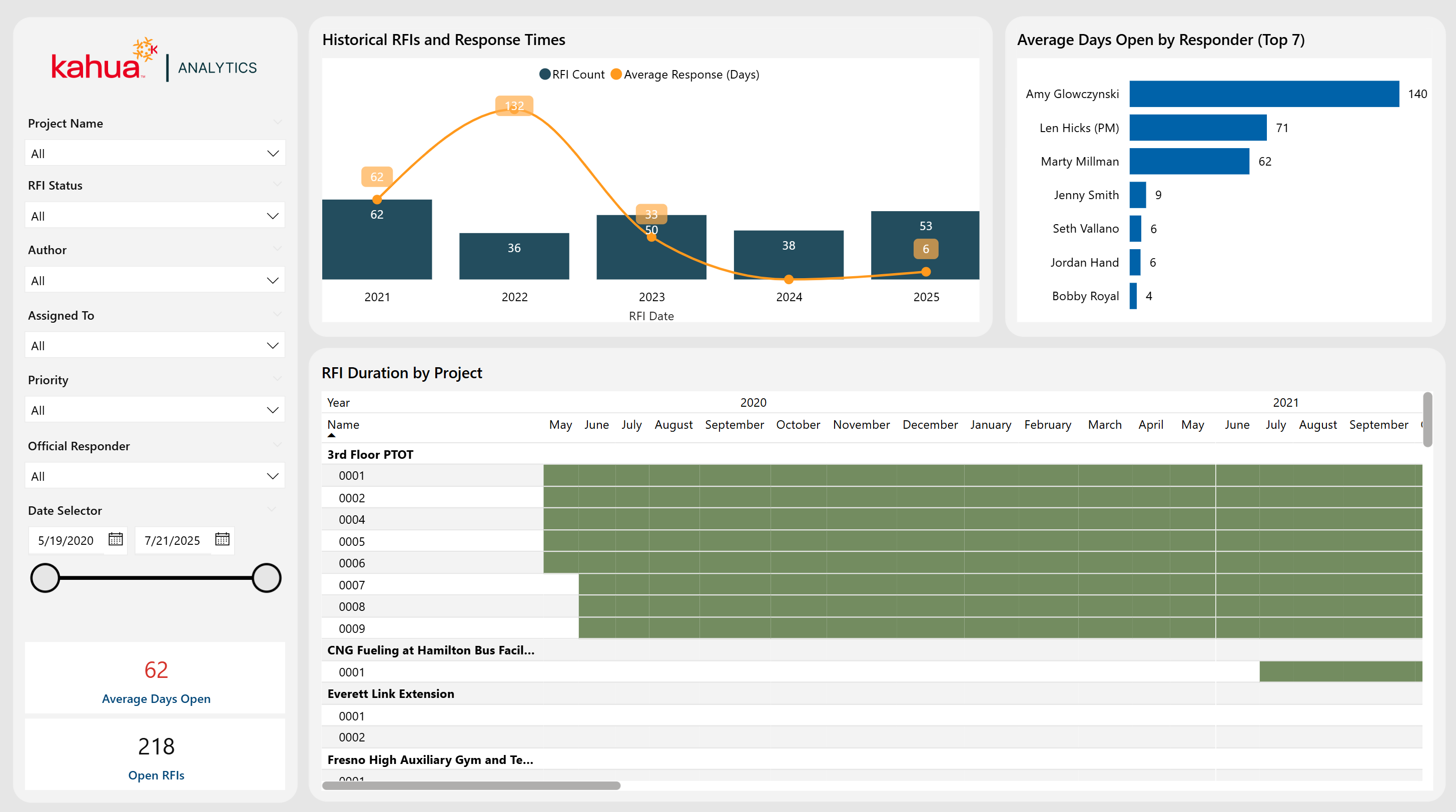
The RFI Timeline Dashboard offers a deeper analysis of RFI deadlines across the portfolio, highlighting the RFI timeline, average days open by top responders, and a historical trend of both RFI counts and response times. A Gantt chart visually illustrates each Project's RFIs from initiation to completion, clearly marking when items were submitted overdue, and total response durations.
Description
This RFI dashboard is comprehensive and time-line focused. It features monthly trends, responder performance metrics, and a project-level Gantt chart.
Problem
Teams can often lack visibility into how quickly RFIs are being addressed. Furthermore, it is difficult to tell whether they are consistently meeting deadlines across various projects.
Benefit
By tracking both volume and turnaround times, users can pinpoint process inefficiencies, identify high-performing responders, and proactively address delays.
The following apps are necessary to utilize this dashboard:
-
Portfolio Manager
-
RFIs
Out of the Box Dashboard Interface
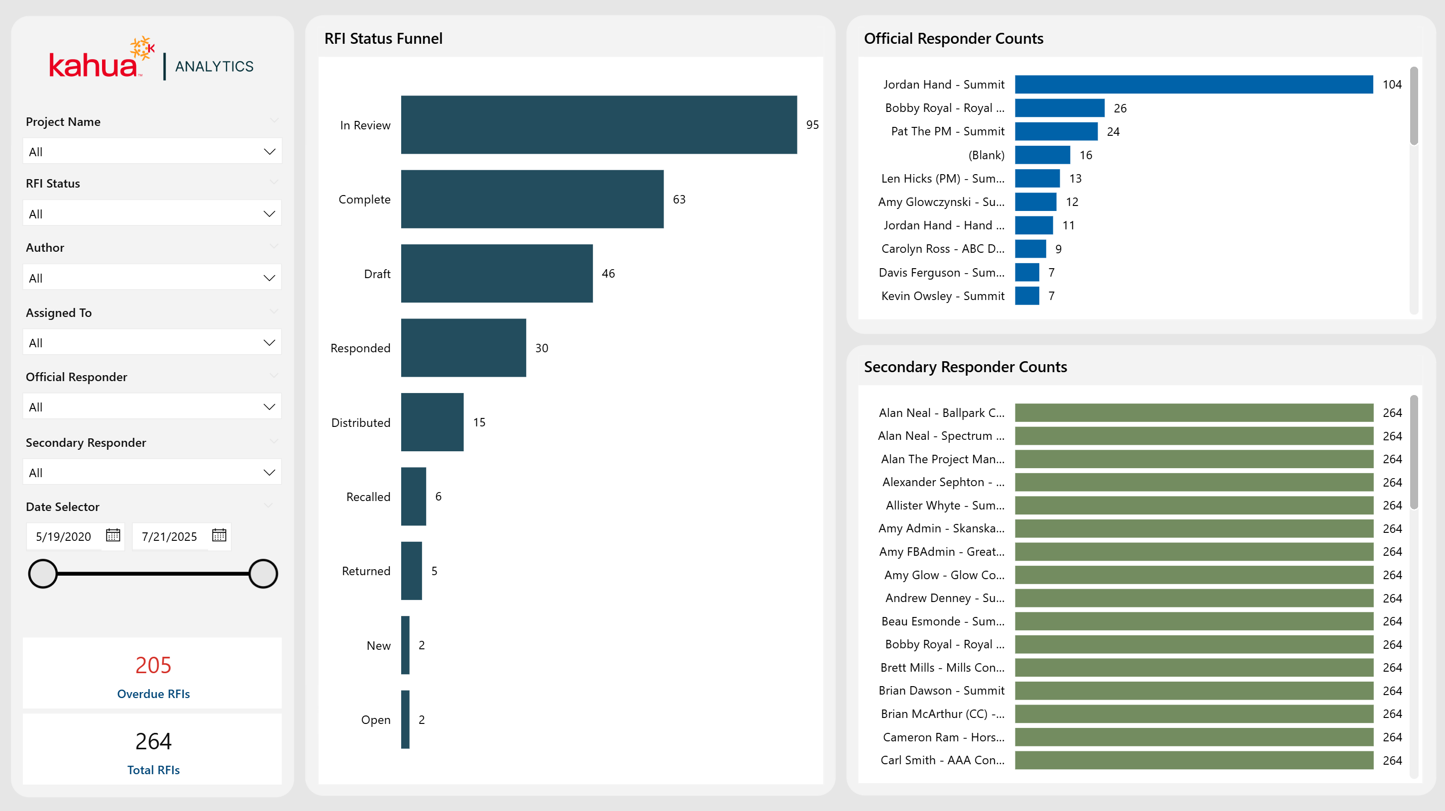
The RFI Funnel Dashboard provides a high-level "funnel" view of all RFIs, focusing on both official and secondary responders. It offers comprehensive filtering options and highlights RFI counts by status and responder role. Thus, it equips teams with insights into workload distribution and overall response efficiency.
Description
This specialized RFI dashboard highlights counts by Status, Official Responder, and Secondary Responder.
Problem
Traditional RFI Tracking can overlook secondary responders, which can lead to incomplete visibility into workload distribution and delays.
Benefit
Teams can utilize this dashboard to audit volume distribution by responder, which can help with response coordination, ultimately improving turnaround times.
The following apps are necessary to utilize this dashboard:
-
Portfolio Manager
-
RFIs
Out of the Box Dashboard Interface
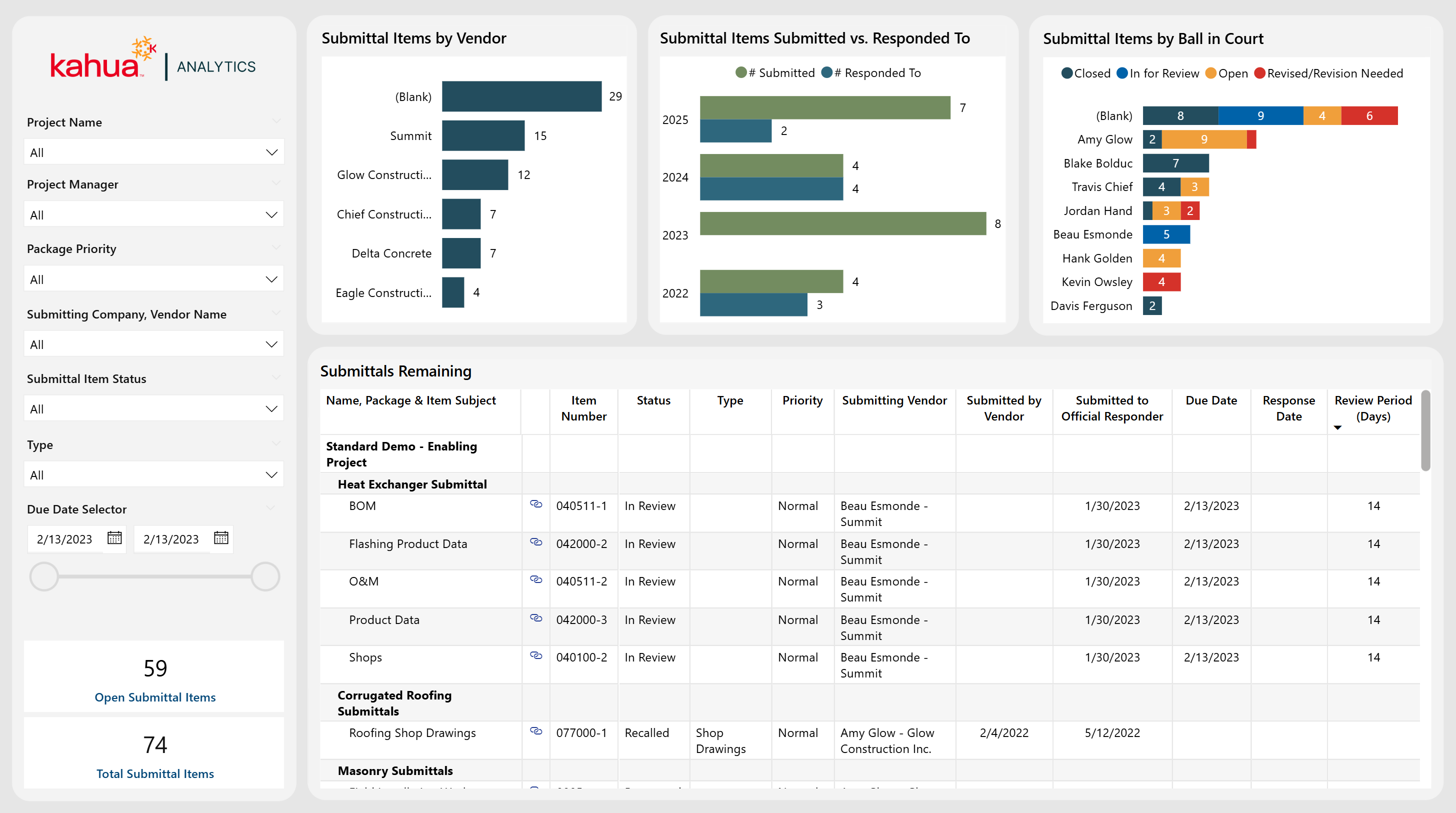
The Submittals Dashboard follows the entire submittal process. It offers visibility into submittal volume, status count by responder, and number of submittals by vendor. In this way, it highlights which vendors are the most active, the number of submitted or responded to over time, and the overall percentage of items completed.
Description
This dashboard offers a log of submittal data with critical details such as item type, status, revisions, and review periods.
Problem
Multiple stakeholders in the submittal process can lead to fragmented communication on submittal item status, which can cause due dates to become overlooked. This can lead to inefficient review cycles.
Benefit
With this dashboard, owners can see which actions are pending, optimize their review workflow, and maintain better quality control across projects.
The following apps are necessary to utilize this dashboard:
-
Portfolio Manager
-
Packaged Submittals
-
Submittal Packages
-
Submittal Items
-
Out of the Box Dashboard Interface
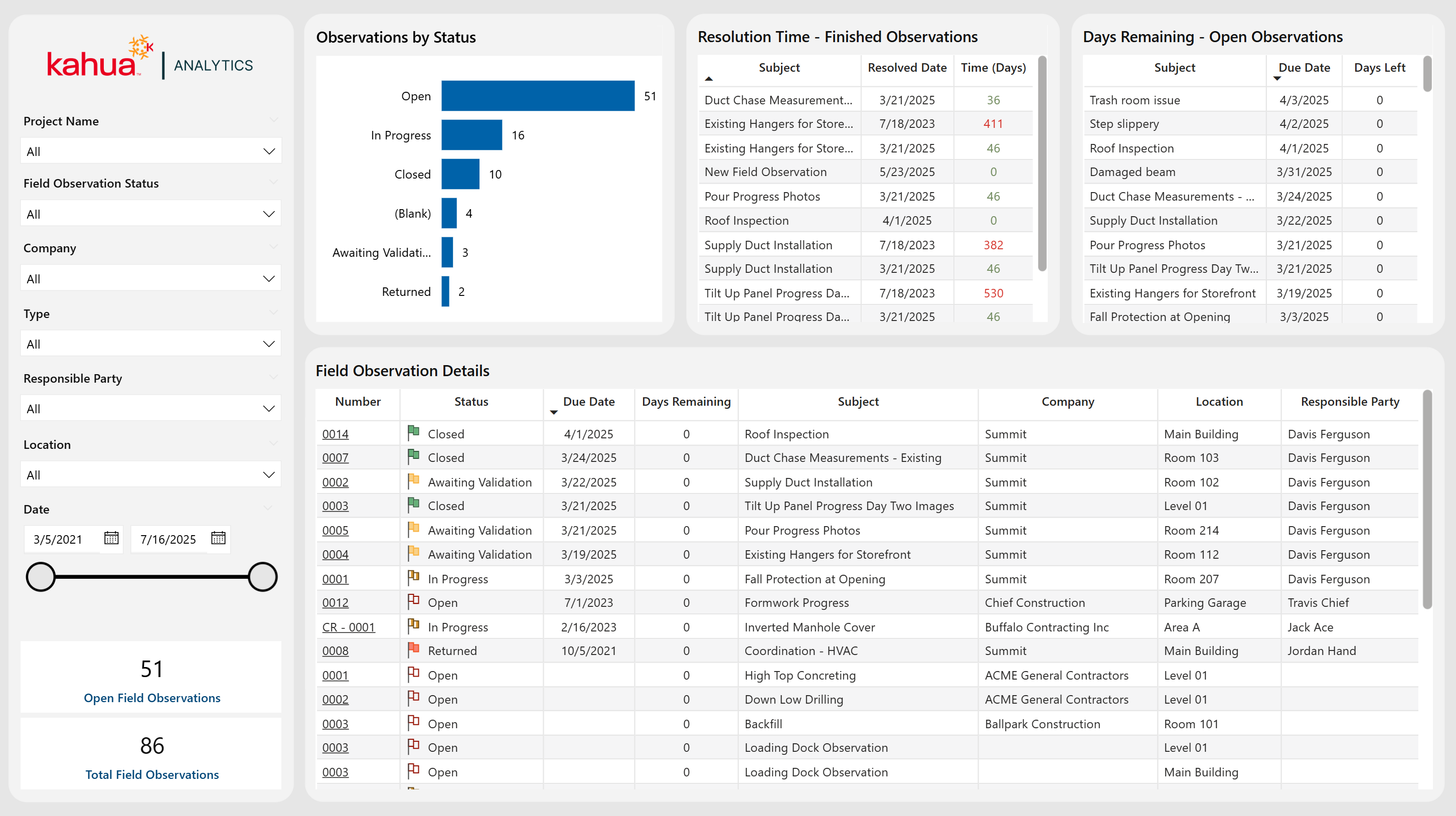
The Field Observations Dashboard provides an organized framework for tracking on-site issues, as well as capturing critical details such as observer, location, and status. Through various visuals, teams can monitor observations by status, spot upcoming due dates, and review how quickly issues resolved.
Description
This dashboard logs all field observations, highlights volume trends, and tracks each item's lifecycle from identification to closure.
Problem
Without clear oversight into all open issues, on-site concerns can remain unresolved for too long. This can jeopardize project timelines and safety.
Benefit
By providing information on the status of observations and their resolution timelines, this dashboard enhances accountability. It also aids in the auditing process and helps teams remain on track when obstacles arise.
The following apps are necessary to utilize this dashboard:
-
Portfolio Manager
-
Field Observations
Out of the Box Dashboard Interface
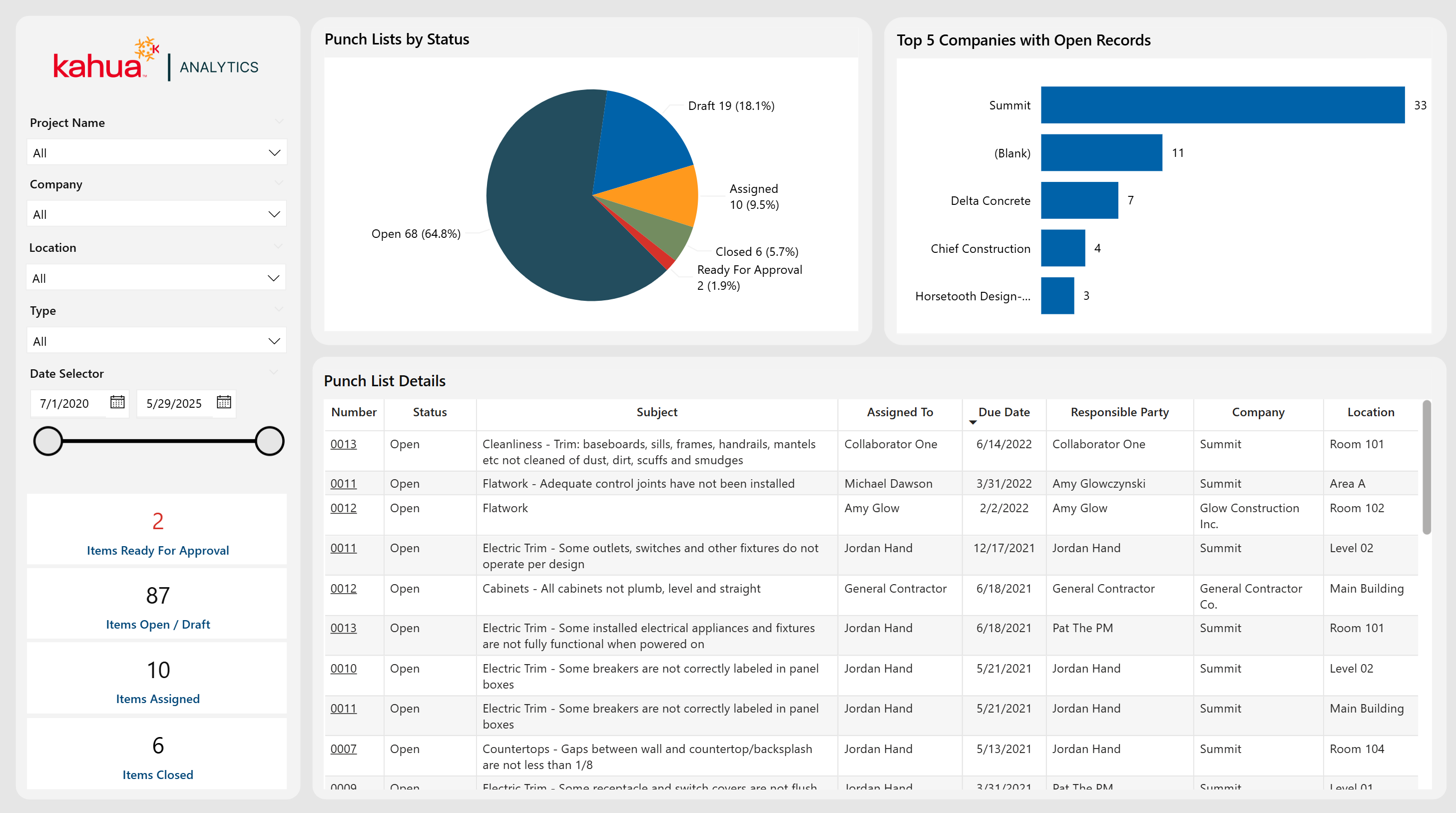
The Punch List Dashboard simplifies project closeout by providing a clear overview of outstanding tasks. Visuals and metrics help to give insight to distribution by status, spotlight top companies with open records, and provide key indicators for items at different workflow stages.
Description
This dashboard delivers a holistic log of Punch List tasks, complemented by status breakdowns and item counts for easy follow-up.
Problem
The management of numerous final items across different stakeholders can be chaotic, risking missed deadlines and extended close-out periods.
Benefit
By allowing owners to monitor open, disputed, and ready-for-approval items, teams can prioritize urgent tasks to ensure a smooth project handover.
The following apps are necessary to utilize this dashboard:
-
Portfolio Manager
-
Punch Lists
Out of the Box Dashboard Interface
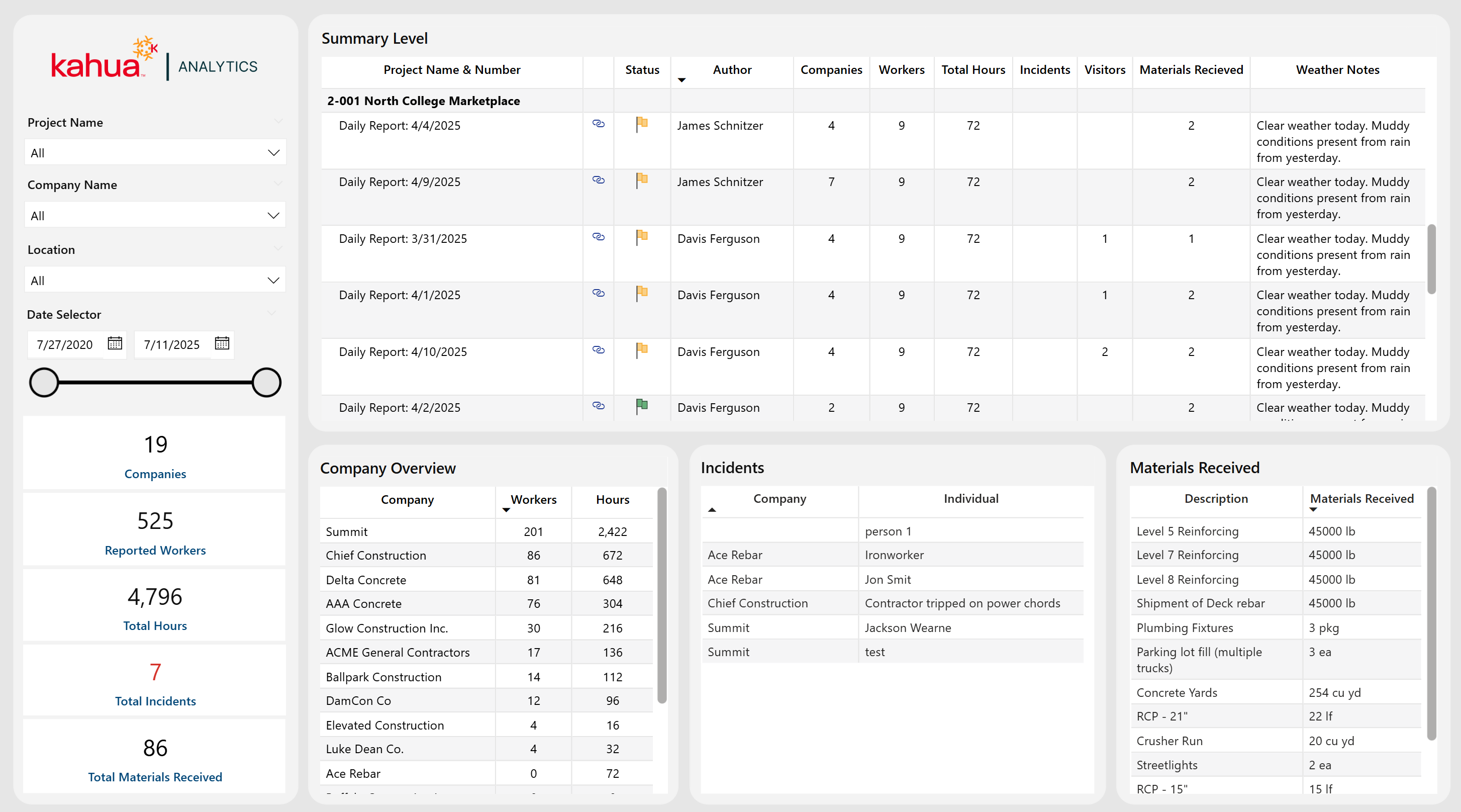
The Daily Reports Dashboard compiles field activities across projects - recording labor counts, hours worked, incidents, visitors, materials, and weather conditions - all linked to specific daily reports. The bottom visuals consist of three individual tables - Companies, Incidents, and Materials Received. Each row represents either a unique company (with worker counts and labor hours), individual incident, or delivered material. The top matrix summarizes key information from each daily report organized by project. The tables below can be used in tandem to drill down to specifics of a selected project or daily report.
Description
This dashboard logs critical daily site information – from labor and hours to incidents and material deliveries – complete with status and workflow insights. The Companies, Incidents, and Materials Received tables automatically filter according to the project or report selected in the top visual and provide granular details.
Problem
Tracking daily field data through scattered reports often leads to incomplete visibility of workforce trends, resource allocation, and on-site incidents. Locating report-centric or project-centric site details can be cumbersome over a large portfolio.
Benefit
By providing a view into daily operations and trends, this dashboard helps teams quickly identify issues, manage human resources effectively, and maintain a detailed project record. Selecting a project or single report immediately reveals which subcontractors were on site, what incidents occurred, and which materials arrived. Thus, this dashboard enhances operational transparency and decision-making.
The following apps are necessary to utilize this dashboard:
-
Portfolio Manager
-
Daily Reports
Out of the Box Dashboard Interface
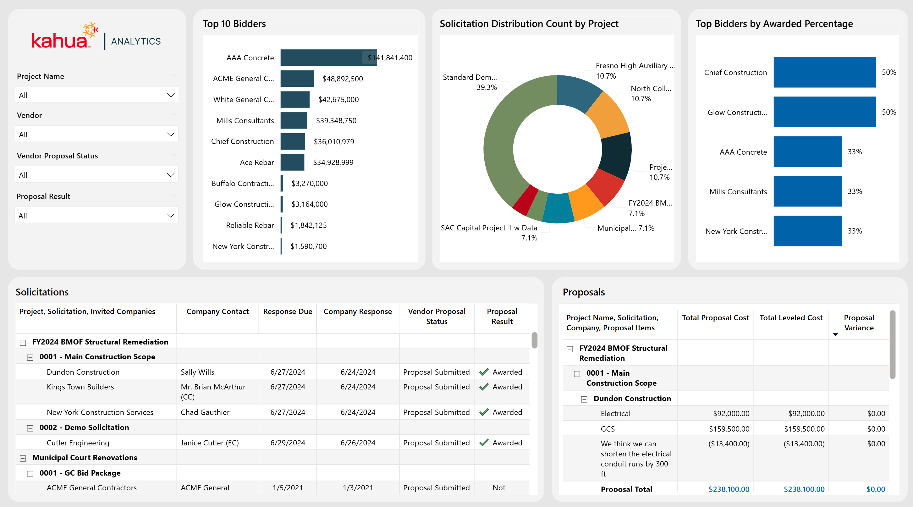
The Bid Solicitations & Proposals Dashboard provides a unified view of bid solicitations across all projects, allowing owners to easily track vendors, proposal details, and award outcomes in real time. Two interactive tables display both high-level and line-item level proposal information. This information is complemented by visuals highlighting solicitation counts, top bidders, and the award percentages of the top bidders.
Description
This dashboard serves as a centralized bid management solution. It displays solicitations, vendor responses, proposal costs, and award data across multiple projects.
Problem
Owners can struggle with manual tracking of multiple bids and vendor proposals across projects, which can lead to inefficiencies and missed opportunities.
Benefit
By consolidating and comparing all bid data in one place, owners gain clarity on vendor performance, reduce administrative overhead, and make more informed awarding decisions based on multiple metrics.
The following apps are necessary to utilize this dashboard:
-
Portfolio Manager
-
Bid Solicitations
-
Bid Proposals
Out of the Box Dashboard Interface
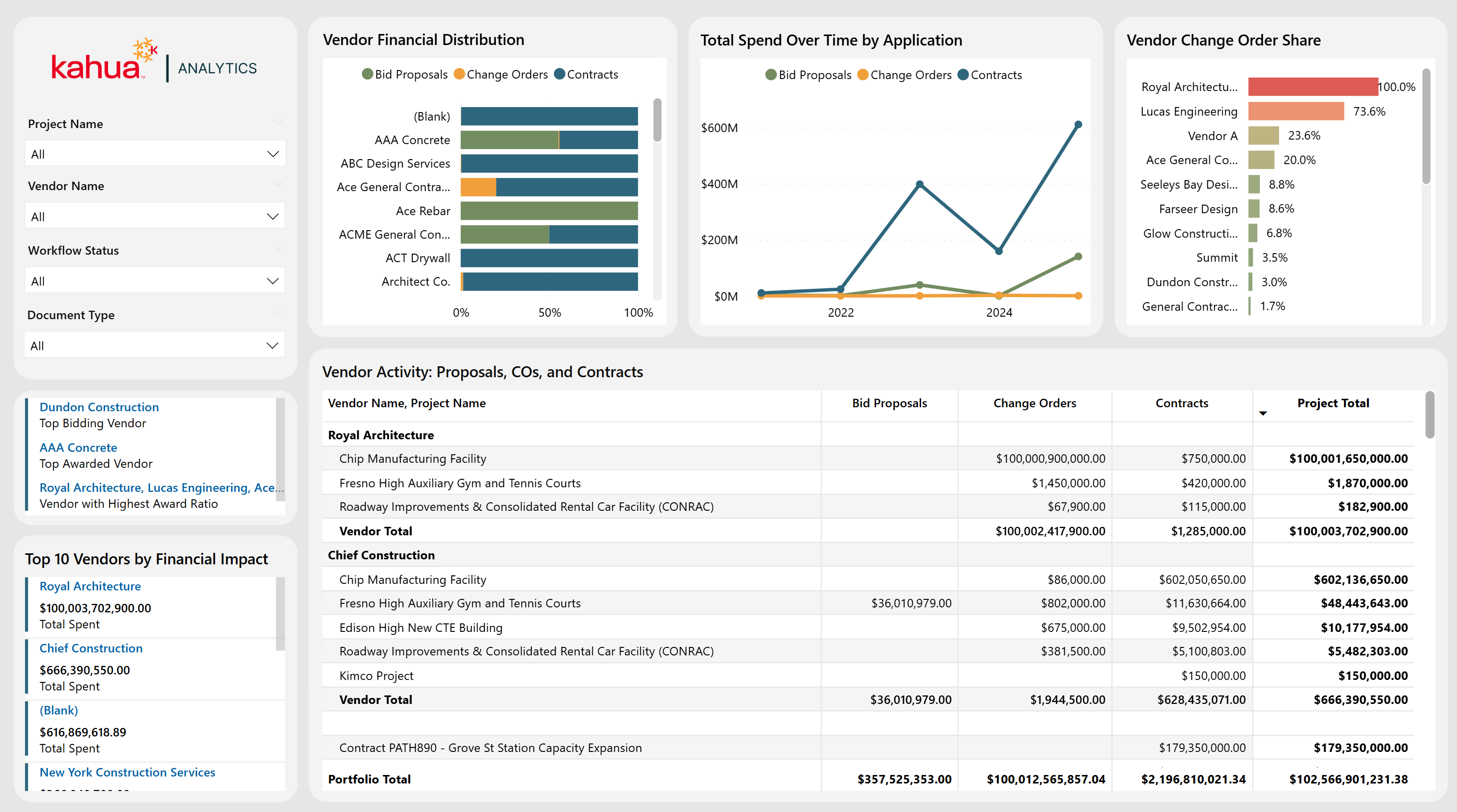
The Vendor Activity Dashboard offers a holistic view of vendor performance across bids, contracts, and change orders. This highlights top bidders, awarded vendors, financial impacts, and volume distribution between apps. Interactive visuals and matrices allow owners to easily assess vendor activity distribution over time. They also provide visibility into high performers, allowing for better vendor decision making on projects.
Description
This vendor-centric dashboard consolidates bids, contracts, and change orders into clear, actionable insights.
Problem
Owners often lack a unified perspective on vendor performance, resulting in hidden cost risks and suboptimal awarding decisions.
Benefit
By allowing visibility into top-performing vendors and tracking cost distribution by different vendors over time, owners can strategically select partners and optimize financial outcomes that best fit their business model.
The following apps are necessary to utilize this dashboard:
-
Portfolio Manager
-
Bid Solicitations
-
Bid Proposals
-
Contracts
-
Change Orders
-
Companies
Out of the Box Dashboard Interface
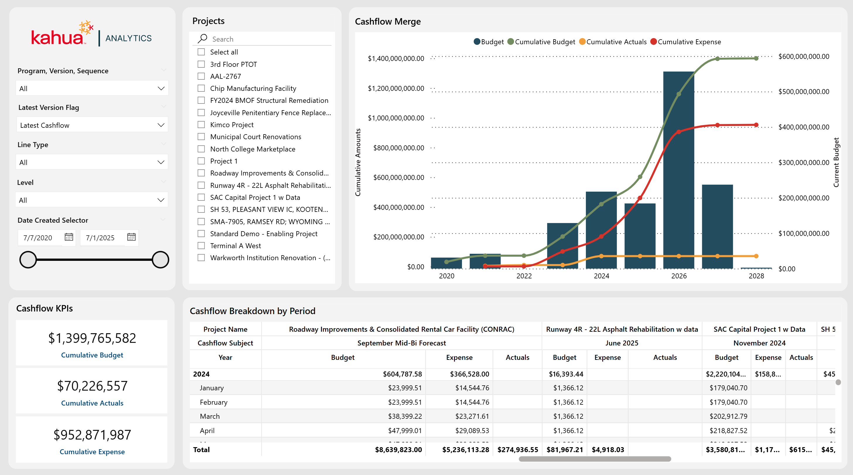
The Program Cashflow Dashboard leverages forecasting data to compare planned allocations, actual expenses, and overall budget across many programs and projects. Filters allow selection of a specific cashflow, version, and sequence, enabling scenario experimentation. Through the ability to track cashflow across different allocation periods, users can see how spending aligns with forecasts. They can then make informed decisions to adjust allocations as needed. Users can upload cashflows at either the program or the project level within Kahua, then consume the data in analytics by setting the "level" to view at. Corresponding downstream projects are easy to filter at either level.
Description
This dashboard provides month-by-month comparison of budgeted versus actual spending. Thus, it enables clear visibility into cashflow trajectories across different programs, projects, and cashflow definitions. With program-level upload capability and partition-level switching, users can view aggregated totals for an entire program, or drill down to individual project breakouts.
Problem
Without unified insight into planned versus actual expenses over time, discrepancies can go unnoticed until costs spiral or budgets become insufficient.
Benefit
Flexible filtering, granular breakdowns, and program-level forecasting make it possible to plan budgets more accurately, identify potential shortfalls by month, and manage both program and project cashflows with precision.
The following apps are necessary to utilize this dashboard:
-
Portfolio Manager
-
Cashflow Forecasting
Out of the Box Dashboard Interface
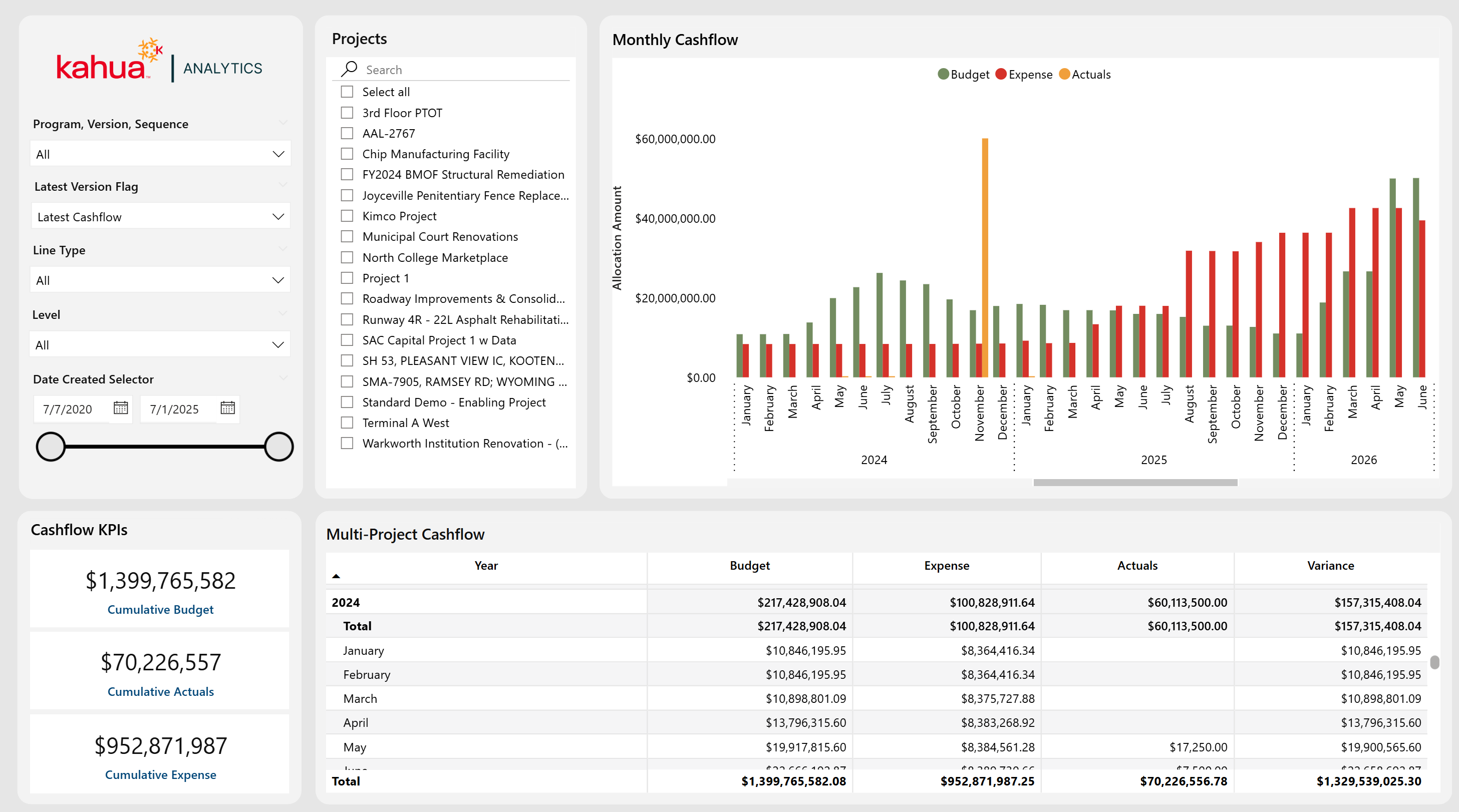
The Program Monthly Cashflow Dashboard provides a month-by-month view of cashflow activity. Thus, teams can compare budgeted allocations, actual expenses, and financial performance on a more granular level. It includes filters for cashflow, version, and sequence - plus a filter for latest cashflow. This dashboard also supports program-level uploads with partition-level switching and downstream project filtering. While it contains similar data to the Program Cashflow Dashboard, it structures the data differently to emphasize short-term financial trends rather than cumulative cashflow progress.
Description
This dashboard tracks financial performance by individual months, with a chart that places budget, expenses, and actuals side by side for each allocation period. The monthly allocation table further breaks down financial values, adding a variance calculation to highlight where actual spending deviates from the budget. Filters allow the selection of a specific cashflow (including version and sequence) or restriction to the latest cashflow. Users can upload cashflows at the program level, switch the partition consumption level, and then filter downstream projects via the left-hand pane.
Problem
Organizations require short-term visibility into spending trends to ensure budgets are being followed and projects are in good financial health. It can be difficult to isolate individual cashflow scenarios or quickly identify deviations from a budget in a given month.
Benefit
With flexible filtering, variance calculations, and program-level upload with partition-level switching, this dashboard enables teams to pinpoint financial variances rapidly, compare multiple cashflow scenarios, and adjust spending before issues escalate.
The following apps are necessary to utilize this dashboard:
-
Portfolio Manager
-
Cashflow Forecasting
Out of the Box Dashboard Interface
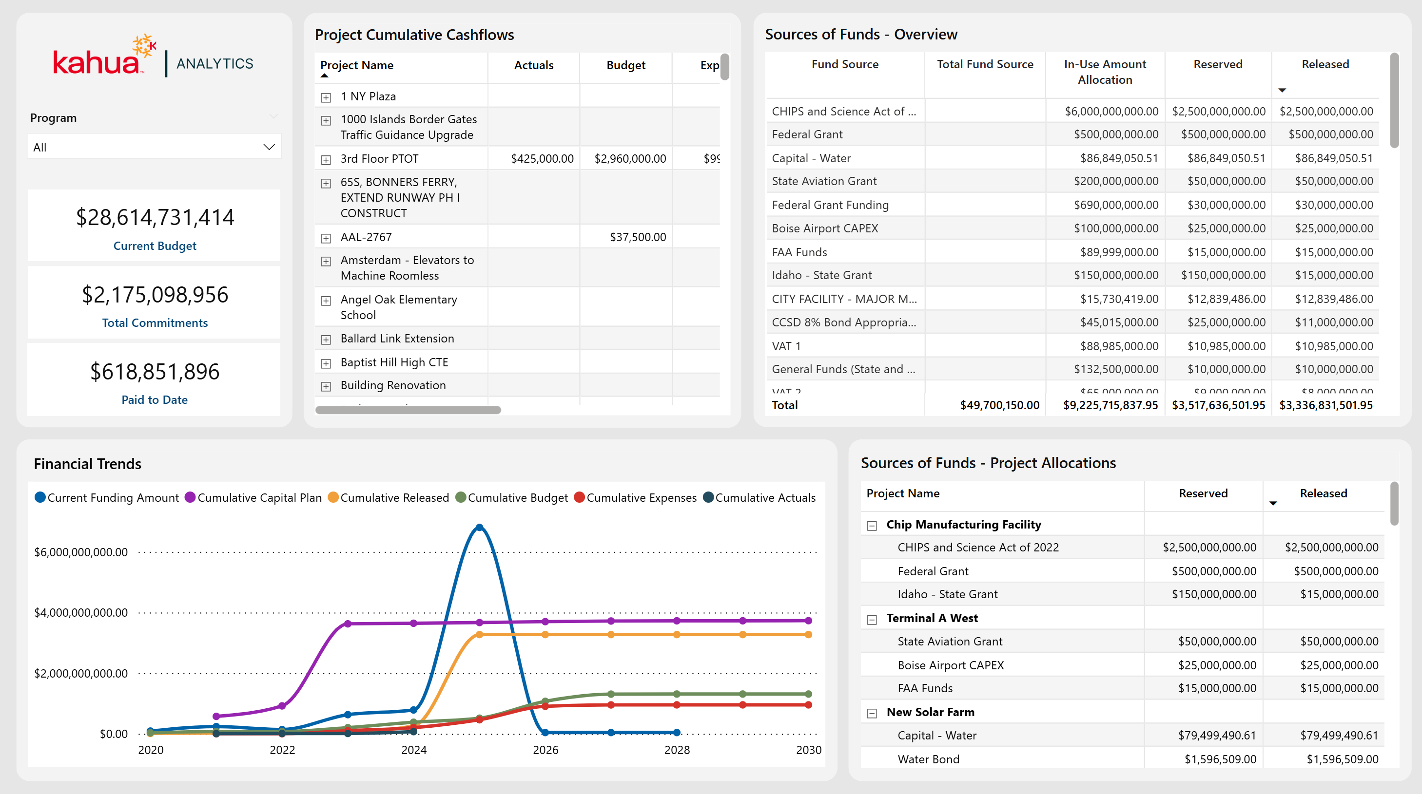
The Program Allocation Overview Dashboard provides a high-level vantage point for analyzing financial data across multiple projects within each program. By connecting Capital Planning, Cashflow Forecasting, and Sources of Funds, it gives owners a holistic perspective on resource distribution, and enables them to forecast funding needs, as well as capital availability.
Description
With the ability to switch between multi-program and program-specific views, this dashboard presents timeseries graphs of capital plans, funding sources and releases, budgets, expenses, and actuals - all in one place. A detailed financial breakdown across multiple apps helps users identify potential surpluses or funding gaps and adjust allocations proactively.
Problem
Owners often struggle to see overall financial health when data is scattered across separate applications or project-level reports. This fragmentation increases the likelihood of budget shortages, as well as available capital that could be invested, which makes it difficult to optimize resource allocation.
Benefit
By unifying important financial metrics at the program level, this dashboard helps owners stay ahead of cashflow needs, quickly reallocate funds if necessary, and maintain greater overall confidence in their budgeting decisions.
The following apps are necessary to utilize this dashboard:
-
Portfolio Manager
-
Capital Planning
-
Cashflow Forecasting
-
Sources of Funds
-
Work Breakdown
Out of the Box Dashboard Interface
The Financial Program Tracker Dashboard builds on the foundation of the Program Allocation Overview by offering an additional, unified budget line that combines both the Cashflow Budget and Capital Plan Allocation.
Description
Designed for a more focused layout for in-depth analysis, this dashboard allows users to track their financials by program or project, with an added budget line that reflects both current and planned spending. By visually comparing this comprehensive budget line against total funding, owners can quickly determine whether they have the capacity for further capital development.
Problem
When finances, specifically budgets, are not clearly integrated, owners may misjudge their actual spending power, which can lead to either missed investment opportunities or overstretched finances. This hampers forward-looking planning, which is essential to strategically allocate funds.
Benefit
With an expanded primary visualization, as well as clear total budget forecasting, this dashboard allows users to monitor program finances at a glance. This way, they can easily identify any gaps or surpluses that may occur well in advance. Owners gain the flexibility to either pursue new initiatives confidently or take corrective steps before costs exceed available funding.
The following apps are necessary to utilize this dashboard:
-
Portfolio Manager
-
Capital Planning
-
Cashflow Forecasting
-
Sources of Funds
-
Work Breakdown
Out of the Box Dashboard Interface
![]()
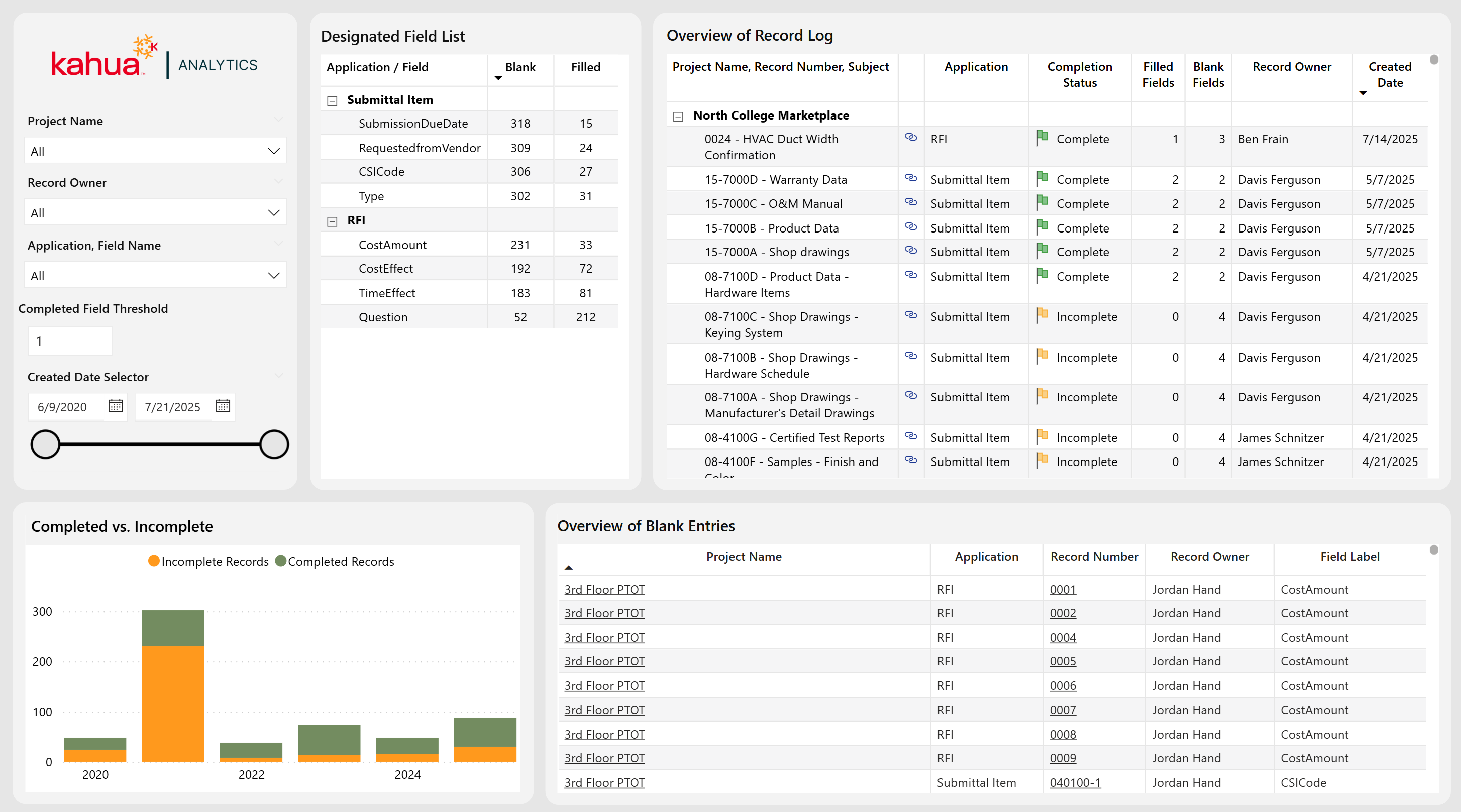
The Data Entry Dashboard provides a record-centric view of all RFI and Submittal documents, enabling users to efficiently audit entries across their portfolio. While the current implementation focuses on RFIs and Submittals, the dashboard is designed to be scalable and can be extended to other applications upon customer request. A key feature of the dashboard is the ability for users to define the number of required fields that must be filled out for a record to be considered "Complete." This configurable logic allows organizations to tailor the dashboard to their unique business needs and workflows. In addition to this functionality, users can use this dashboard as a navigational tool to edit records and find gaps in data quality.
Description
With a current focus on RFIs and Submittals applications, the Data Entry Dashboard allows users to locate gaps in quality data. They can also define any number of required fields for a complete record. This allows for a configurable experience, unique to a business' wants and needs.
Problem
When users neglect to fill out record fields, it leads to lack of communication and project delays. Gaps in necessary and high-quality data worsen these issues.
Benefit
With this dashboard, users can locate and address gaps in provided information. By making fields required, these issues will be easily rectified. This will streamline the overall process of submitting and replying to RFIs and Submittals.
The following apps are necessary to utilize this dashboard:
-
Portfolio Manager
-
RFIs
-
Submittals
-
Contacts
-
Companies
-
People
-
Out of the Box Dashboard Interface
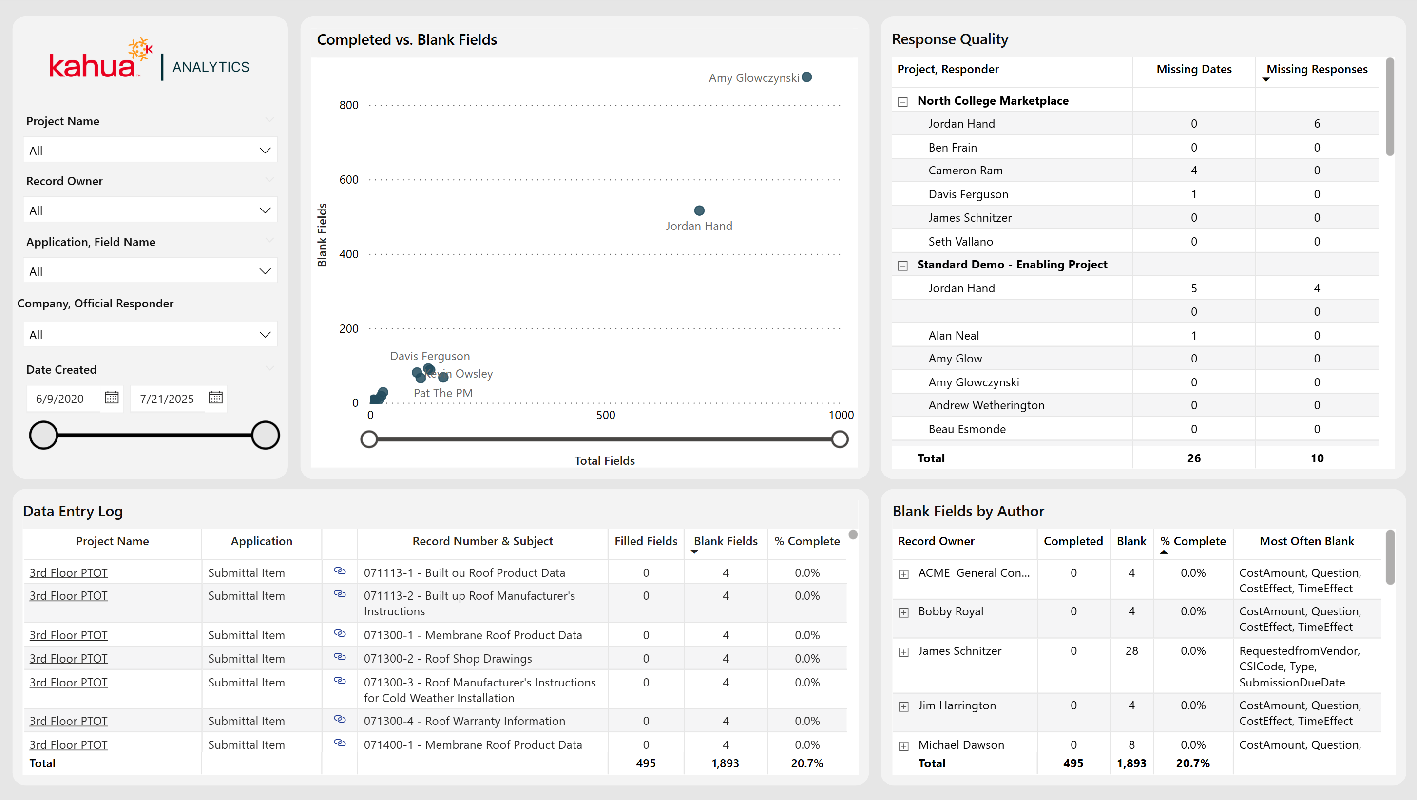
The Data Entry Dashboard provides users with enhanced visibility into data ownership and completion across record owners. The primary visualizations display the total number of fields owned alongside the number of blank fields, enabling quick identification of data gaps. In addition to insights by record owner, the dashboard also highlights the quality of responses received from external reviewers. Users can interact with the dashboard to efficiently navigate the platform, including direct links to specific documents for easy access and record updates.
Description
This dashboard allows users to identify consistently missing data, as well as assess the quality of responses given. With the capability to view record fields across multiple apps, users can now identify which record owners offer limited or no essential information.
Problem
The absence of essential field data can slow and elongate the construction process. With fragmented data, it can be unclear whether individuals are consistently neglecting to fill out certain fields. This causes owners undue stress and places roadblocks along the path to project success.
Benefit
With this dashboard, owners can easily locate patterns of frequently missing data. Also, they can view the quality of responses given. Thus, they can address issues with both the complete lack of and insufficient amount of necessary information.
The following apps are necessary to utilize this dashboard:
-
Portfolio Manager
-
RFIs
-
Submittals
-
Contacts
-
Companies
-
People
-
Out of the Box Dashboard Interface