Using in-app summary dashboards
This feature was released as a preview in the 2026 Q3 release. Similar dashboards will be added to additional applications through maintenance releases.
The In-app summary dashboards provide a real-time visual summary directly above the log view in applications where they appear. The dashboards provide quick visibility into actionable items, including open, overdue, and aging items, Ball-In-Court (BIC) assignments, schedule risk, and response activity without leaving the log view.
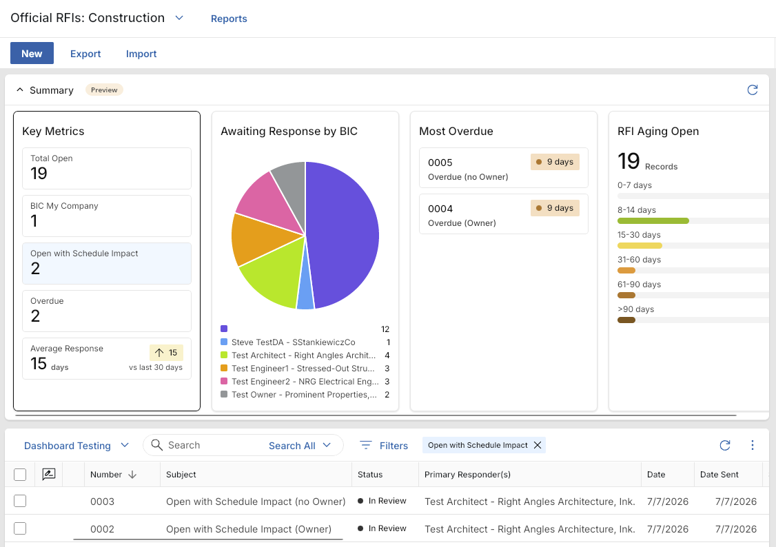
Key elements to know about this feature include the following:
-
The in-app dashboard appears automatically above the log view when you open the application.
-
The dashboard is intended to help you filter the log and take action on current records. It is not intended to replace the Dashboards app or Kahua Analytics.
-
The dashboard is not configurable. You cannot add, remove, or modify the widgets in the summary dashboard.
-
Dashboard elements are clickable. Selecting a bar, pie slice, count, or table item filters the log view to matching records.
-
Dashboard filters can be used with quick filters in the log view to further refine the list.
-
The dashboard recalculates when you switch to a different app list.
-
You can collapse the dashboard from the Summary bar. Kahua remembers your preference across sessions.
-
At this time, the dashboard is available in the desktop and web hosts. Mobile phone, iPad, and tablet browsers are not included.
-
If an application in your domain has a custom extension, the in-app dashboard may not appear.
Note If you do not want to have in-app dashboards appear in your domain, or if they do not appear due to a custom extension and you want to add them, reach out to Support or your account representative for assistance.
How to . . .
 Review the available widgets
The in-app dashboards are currently available in the following applications:
FCA (Facility Condition Assessment)
The FCA (Facility Condition Assessment) app includes the following sub-applications:
Campaigns
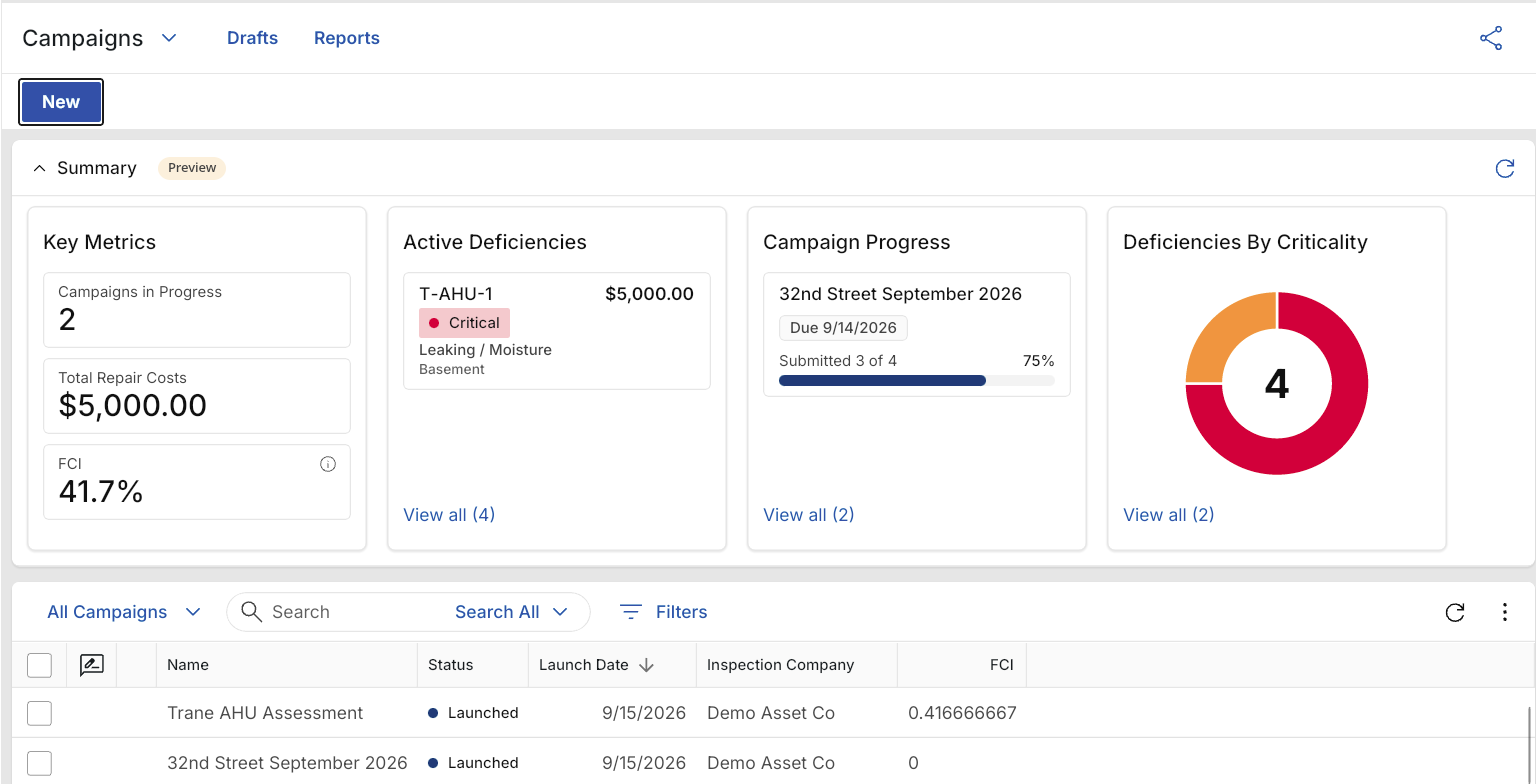
The Campaigns Summary dashboard includes the following predefined widgets:
| Widget | Description |
|---|---|
| Key Metrics | Key metrics for Campaigns include Campaigns in Progress, Total Repair Costs, and FCI. |
| Active Deficiencies | A list displays active deficiencies with the asset, criticality, type, location, and repair cost. |
| Campaign Progress | A list displays campaign progress, including the campaign name, due date, submitted count, and completion percentage. |
| Deficiencies By Criticality | A donut chart displays deficiencies grouped by criticality. |
Assessments
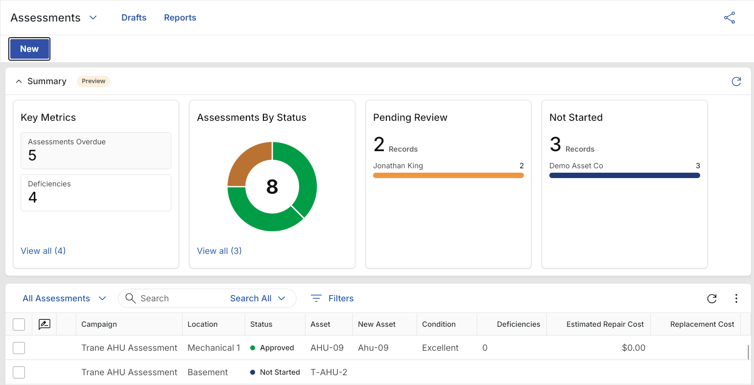
The Assessments Summary dashboard includes the following predefined widgets:
| Widget | Description |
|---|---|
| Key Metrics | Key metrics for Assessments include Assessments Overdue and Deficiencies. |
| Assessments By Status | A donut chart displays Assessments grouped by status. |
| Pending Review | A list displays Assessments pending review, grouped by the responsible contact, with a count and progress bar. |
| Not Started | A list displays Assessments that have not started, grouped by the responsible company, with a count and progress bar. |
Deficiencies
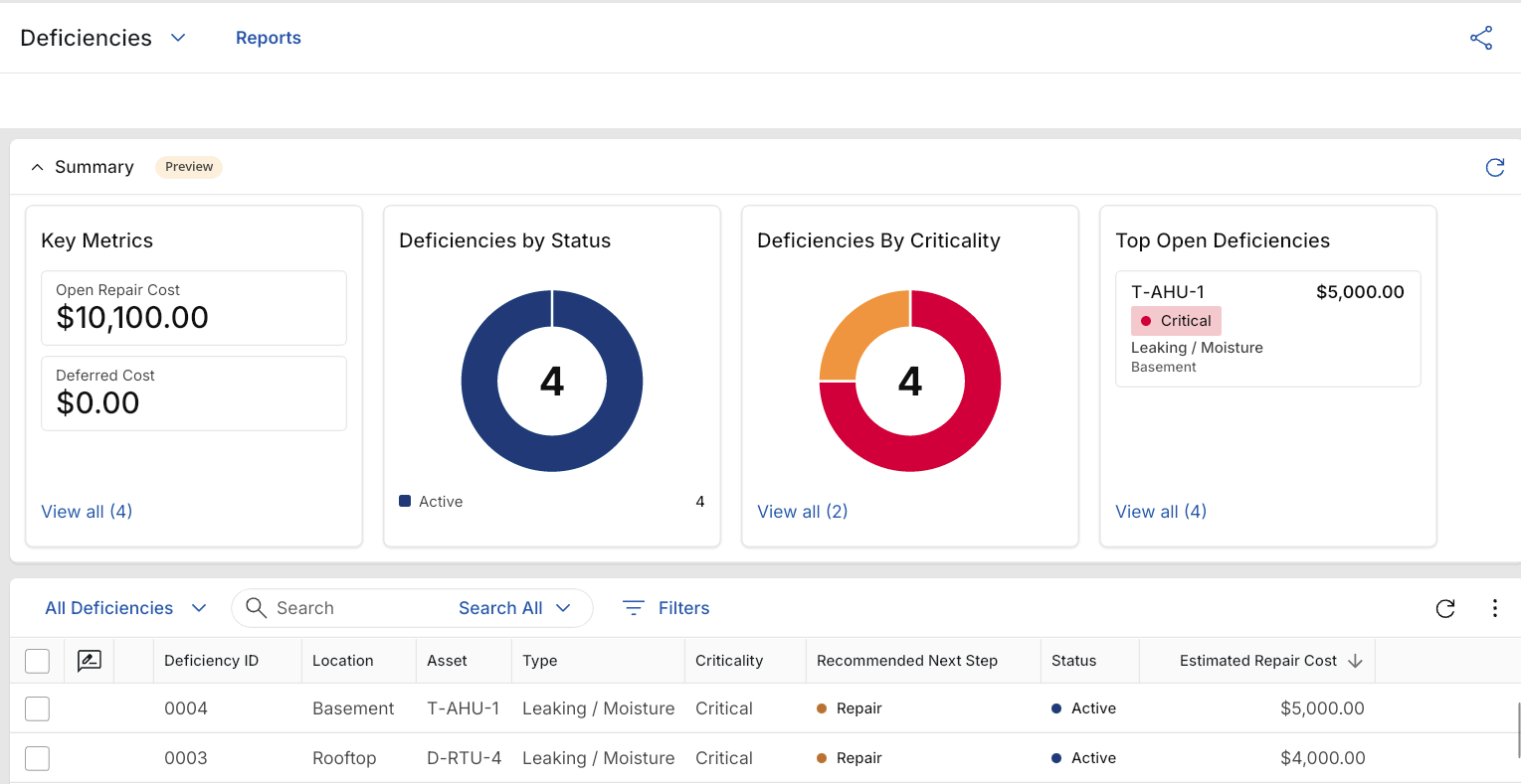
The Deficiencies Summary dashboard includes the following predefined widgets:
| Widget | Description |
|---|---|
| Key Metrics | Key metrics for Deficiencies include Open Repair Cost, Deferred Cost, Unestimated, and Actual Repair Cost. |
| Deficiencies by Status | A donut chart displays deficiencies grouped by status. |
| Deficiencies By Criticality | A donut chart displays deficiencies grouped by criticality. |
| Top Open Deficiencies | A list displays open deficiencies with the asset, repair cost, criticality, type, and location. |
Field Observations
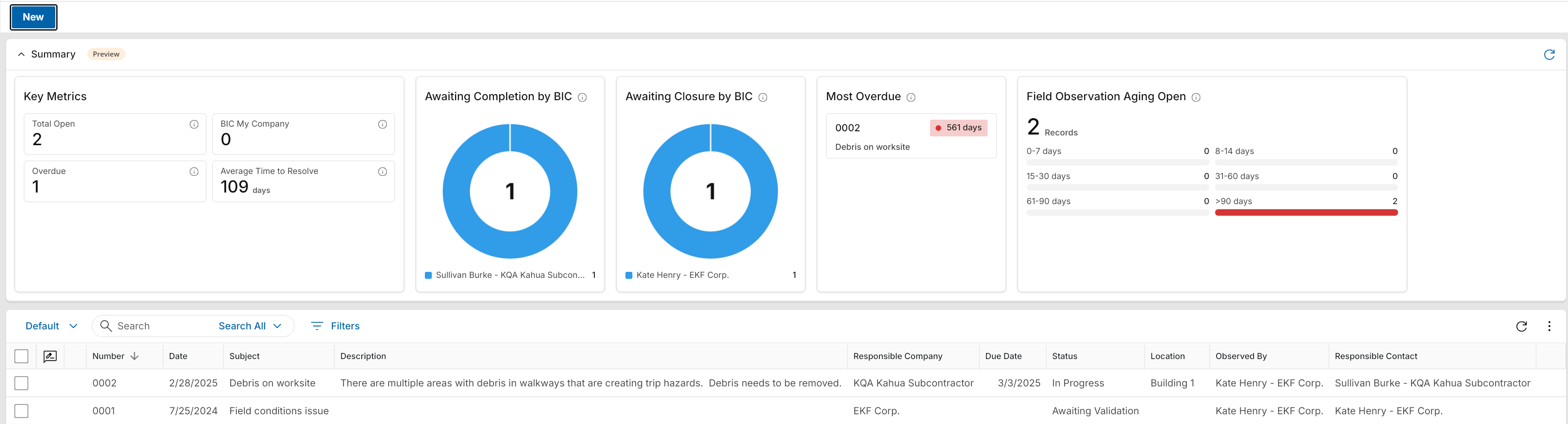
The Field Observations Summary dashboard includes the following predefined widgets:
| Widget | Description |
|---|---|
| Key Metrics | Key metrics for Field Observations include Total Open, BIC My Company (Ball-in-Court), Overdue, and Average Time to Resolve. |
| Awaiting Completion by BIC | A donut chart displays Field Observations awaiting completion, grouped by the company or contact responsible for completing them. |
| Awaiting Closure by BIC | A donut chart displays Field Observations awaiting closure, grouped by the company or contact responsible for closing them. |
| Most Overdue | A card lists the Field Observation with the greatest number of overdue days. Select the observation to open it in the detail view. |
| Field Observation Aging Open | Open Field Observations grouped by number of days open, including 0-7, 8-14, 15-30, 31-60, 61-90, and more than 90 days. |
Punch List Items
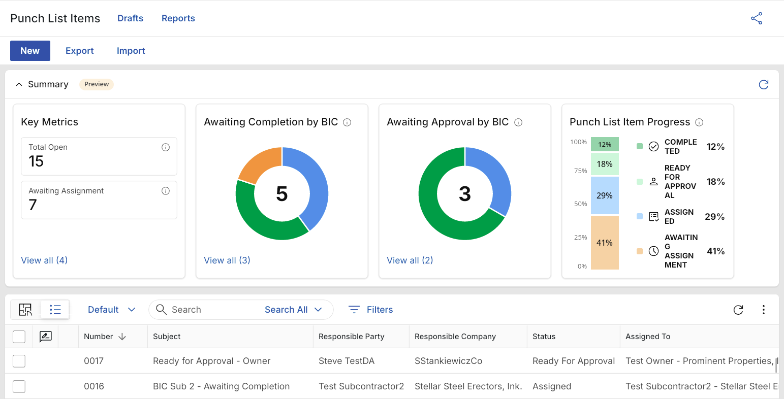
The Punch List Items Summary dashboard includes the following predefined widgets:
| Widget | Description |
|---|---|
| Key Metrics | Key metrics for Punch List Items include Total Open, Awaiting Assignment, BIC My Company, and Overdue. |
| Total Open | A count of Punch List Items that have not been completed. |
| Awaiting Assignment | A count of Punch List Items without a responsible contact. |
| BIC My Company | A count of Punch List Items assigned to your company. |
| Overdue | A count of incomplete Punch List Items with a due date before the current date. |
| Awaiting Completion by BIC | A donut chart shows Punch List Items awaiting completion, grouped by ball-in-court (BIC). |
| Awaiting Approval by BIC | A donut chart shows Punch List Items awaiting approval, grouped by ball-in-court (BIC). |
| Punch List Item Progress | A stacked bar chart shows the percentage of Punch List Items by status, including Completed, Ready for Approval, Assigned, and Awaiting Assignment. |
RFIs
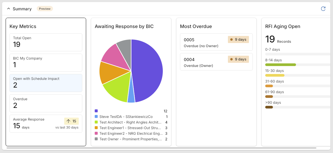
The RFI Summary dashboard includes the following predefined widgets:
| Widget | Description |
|---|---|
| Key Metrics | Key metrics for RFIs include Total Open, BIC My Company (Ball-in-court), Open with Schedule Impact, Overdue, and Average Response. |
| Awaiting Response by BIC (Ball-in-Court) | A pie chart display of RFIs awaiting a response, grouped by whom the response is due from. |
| Most Overdue | A list of the individual RFIs with the highest number of overdue days. Click on an individual RFI to open it in the detail view. |
| RFI Aging Open | Open RFIs grouped by number of days open. |
Submittal Items
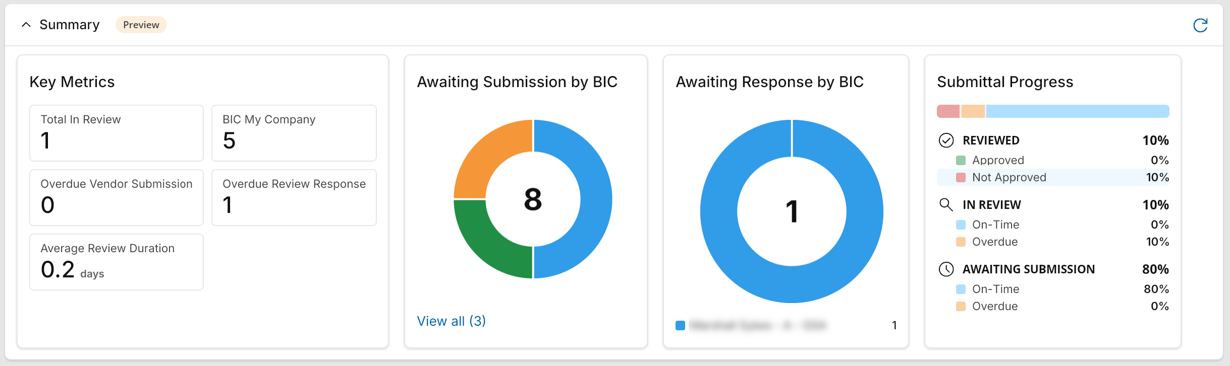
The Submittal Items Summary dashboard includes the following predefined widgets:
| Widget | Description |
|---|---|
| Key Metrics |
Key metrics for Submittal items include Total in Review, BIC My Company (Ball-in-court), Open Vendor Submission, Overdue Review Response, and Average Review Duration. |
| Awaiting Submission by BIC (Ball-in-Court) |
A pie chart display of submittal items awaiting submission, grouped by whom the submission is due from. |
| Awaiting Response by BIC (Ball-in-Court) |
A pie chart display of submittal items awaiting a response, grouped by whom the response is due from. |
| Submittal Progress |
Percentage of submittals Approved, Not Approved, On-Time, and Overdue, grouped by Reviewed, In Review, and Awaiting Submission statuses. Note Items are considered "Approved" when the Count as Approved flag is selected. For more information, refer to Responses to Count as "Approved". |
Submittal Packages
The Submittal Packages Summary dashboard includes the following predefined widgets:
| Widget | Description |
|---|---|
| Key Metrics |
Key metrics include Total In Review, BIC My Company (Ball-in-Court), Overdue Vendor Submission, Overdue Review Response, and Average Review Duration. |
| Total In Review |
A count of submittal items with the In Review status. |
| BIC My Company |
A count of submittal items currently assigned to a person at your company. |
| Overdue Vendor Submission |
A count of submittal items awaiting vendor submission whose submission due date is before the current date. |
| Overdue Review Response |
A count of submittal items with the In Review status whose response due date is before the current date. |
| Average Review Duration |
The average number of days that completed reviews took. The calculation includes items with a date submitted to the official reviewer and an official response date. The trend compares the value with the previous 30 days. |
| Awaiting Submission by BIC (Ball-in-Court) |
A donut chart shows submittal items that are not yet in review, grouped by the company currently responsible for them. |
| Awaiting Response by BIC (Ball-in-Court) |
A donut chart shows submittal items with the In Review status, grouped by the company currently responsible for the response. |
| Submittal Package Progress |
A stacked bar chart shows the percentage of submittal items in the Reviewed, In Review, and Awaiting Submission phases. Reviewed items are grouped as Approved or Not Approved. In Review and Awaiting Submission items are grouped as On-Time or Overdue, based on the response due date or submission due date, respectively. Note Items are considered "Approved" when the Count as Approved flag is selected. For more information, refer to Responses to Count as "Approved". |
View and work with the summary dashboard
To view an in-app summary dashboard, complete the following steps:
-
Review the header to ensure that you are in the correct project or partition.
-
Navigate to the appropriate application.
-
The in-app dashboard appears above the log view in the Summary section. If closed, click on the summary header to expand it.
-
Use the widgets to review and identify records that may require action.
-
You can take the following actions on the in-app dashboard:
Action Description Click on a filtered element in a dashboard widget
Some widget elements contain groups of filtered items, such as Open RFIs or Overdue items.
When you click on one of those elements in a widget, the log view is filtered to contain only the records pertaining to that element (e.g., clicking on Key Metrics > Open with Schedule Impact filters the log view for just those RFIs).
The applied filter appears on the log view header and can be removed by clicking the Close icon
 next to the filter name or by clicking again on the filtered element.
Note You can use quick filters on the filtered log view to further filter a list. Refer to Apply a quick filter.
Click on a record that appears in a dashboard widget
Some widget elements reference a single record, such as "Most Overdue".
In that case, clicking on the element opens the detailed view of the referenced record. From there you can act on the record.
Adjust the in-app dashboard and log view divider
You can click and drag on the divider between the Summary section and the log view section to reduce or expand the space available for the in-app dashboard.
When you do so, the elements in the in-app dashboard that are hidden can be viewed by clicking the View all (#) tag that appears. This will open a modal window that contains all the elements of that dashboard widget.